brucewilsongraphics

Graphic Design, University of Kent

Category: Uncategorized

Evaluation & Reflection

by brucewilsongraphicdesign

Evaluation & Reflection

What are the strengths of the visual communication?

I feel my work is bold and powerful. The colour schemes of the packs are kept to black and white, so the contrasting blue on the box and the logo works well.

The typography of the calendar, photographic book, business card and C.V’s are neat and effective and kept to an absolute minimum to allow the visuals of the client’s photography to work most effectively and add prominence to their photographs.

Presentation

by brucewilsongraphicdesign

Presentation Presentation Presentation  PresentationPresentationPresentation

Box Logo

by brucewilsongraphicdesign

Box Logo Box Logo Box Logo

Box & Packs

by brucewilsongraphicdesign

Box & Packs Box & Packs Box & Packs Box & Packs Box & Packs Box & Packs Box & Packs Box & Packs Box & Packs Box & Packs Box & Packs Box & Packs Box & Packs Box & Packs

Sleeves For Each Of The Packs

by brucewilsongraphicdesign

A Logo For My Company

by brucewilsongraphicdesign

The name for my company is ‘Prism’, after the name of a part of a photographers camera.

Envelopes For The Packs

by brucewilsongraphicdesign

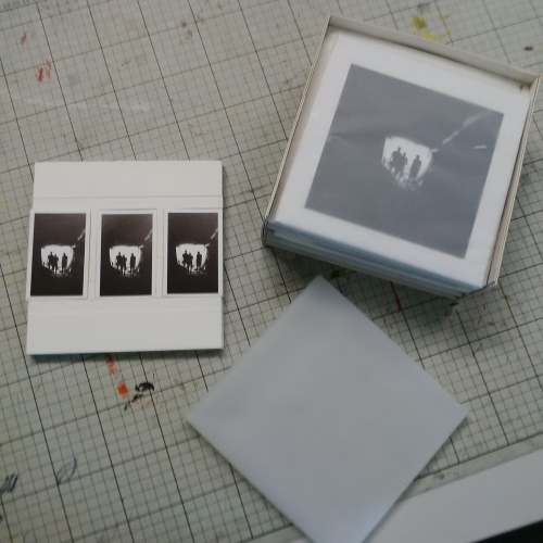
Each of the packs have loose items, other than the photographic book of course, I therefore must produce some form of envelope to seal the packs and keep everything together, aswell as to give a nice neat finish to the work.

I weighed up the pros and cons of a number of different envelope packaging materials, such as paper, card, tissue paper, tracing paper and so on.

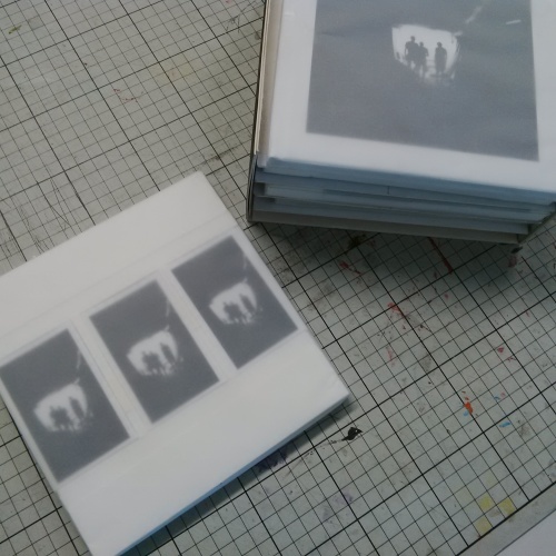
I thought that tracing paper would be the best option for my packs. That way the client can see through the packaging and at their items through the paper which is a nice touch. I also really like the feel of the paper and the light white translucent surface and paper weight is perfect for what I’m after.

Packs

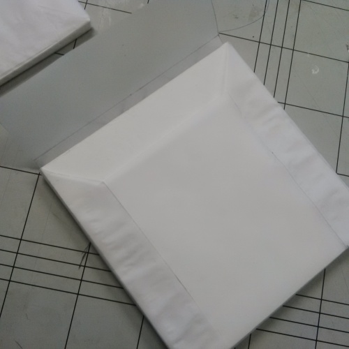
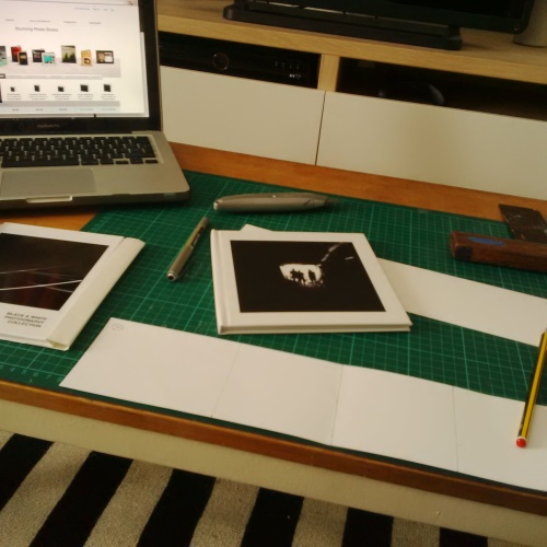
I measured up the packs and used the same dimensions for each. As you can see above, I used these measurements to produce a net. The fold lines and tabs are visible, I cut out the net using a pair of scissors or a scalpel, and check that the size is perfect with the contents before moving onto the next steps.

Packs

Once the net is cut I place the pack into the centre of it and fold the tracing paper around it, the tabs at the bottom corners of the glued in place and watered down PVA is used to secure the side tabs and seal the envelope.

The sides are sealed around the pack creating the envelope. The top flap is kept loose and simply tucks under the top opening to seal up the envelope. I can use a sticker or tab to properly seal the parcels at some stage, for the time being, and for my prototype box I will keep them open and tucked in so they can be resealed for demonstration purposes.

Packs

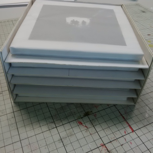
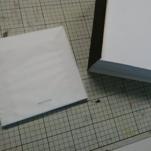
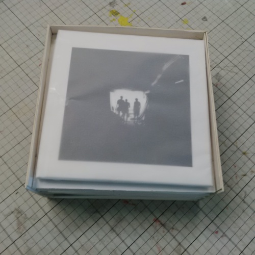
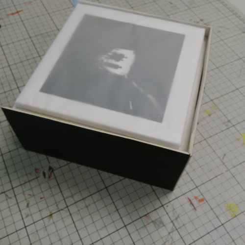
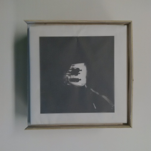
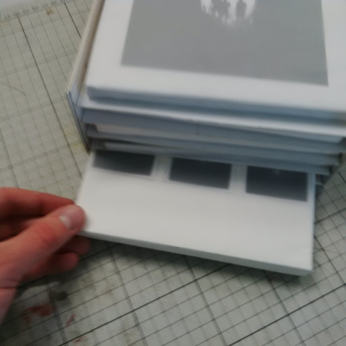
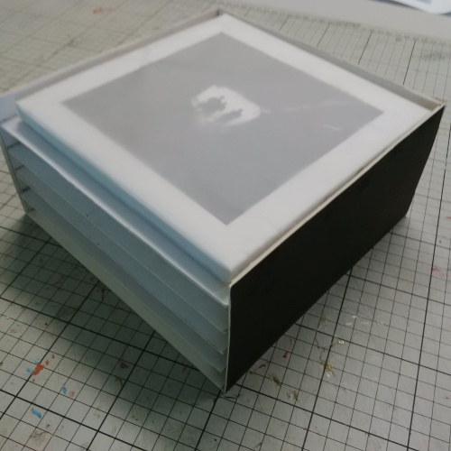
Above you can see all of the packs have their own tracing paper envelope, I think the final effect is very good, it looks neat and professional, with the image from the packs visible through the paper.

Now that this stage of the prototype is finished I need to move onto creating the sleeves for each pack.

Final Business Card Pack

by brucewilsongraphicdesign

Business Cards Business Cards Business Cards Business Cards Business Cards Business Cards Business Cards Business Cards Business Cards

Making The Packs As A Set

by brucewilsongraphicdesign

For the box the packs each need to be the same size. As I have previously shown, the size of the cards for the calendar, the cv’s and the business cards are smaller than the book which is the size I need all the packs to conform to.

Packs

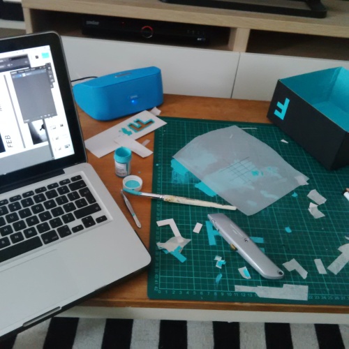
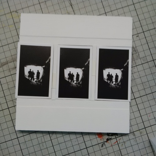
Above you can see my workings on the cutting mat, measuring and sizing up the book and working out a way of making the smaller cards fit.

Initially I though folding a piece of thick board to house the cards would work well. However, it wasn’t study enough with the empty space in the middle of the fold, and using a thick enough card made crease lines visible and the folding itself difficult.

Packs

I decided to use a different approach and use cut wooden pieces instead of the folded board. A piece either side of the cards and glued onto the base piece, which is the same size as the book will house them very effectively.

I measure up the wooden pieces and cut them to size by hand with a junior hack saw. Once cut I glue the pieces together and then glue them to the square base piece of board, simply using PVA glue.

Packs

After the pieces are glued and sanded down, I use white paint and apply several coats to finish off the holders for the cards and make them look neat, tidy and professional.

Once these are finished the next stage is to the fit the cards in and look at producing some sort of envelope or cover to seal the packages.

Final Printed Photographic Cards

by brucewilsongraphicdesign

Cards Cards Cards Cards Cards Cards

Producing The Pack Of Cards

by brucewilsongraphicdesign

I started another Adobe Illustrator document for producing the photographic cards for my client.

Photographic Cards

As with the calendar, the first stage is to collate the images that I will be using for the cards.

In this case there are 1o, I then drag and drop from the iPhoto folder, into the document, and alter the size to the required measurements (the same as the small square photographic book).

Above you can see one of the images being sized and moved into the template I have made for each card, to keep each on uniform and identical.

Photographic Cards

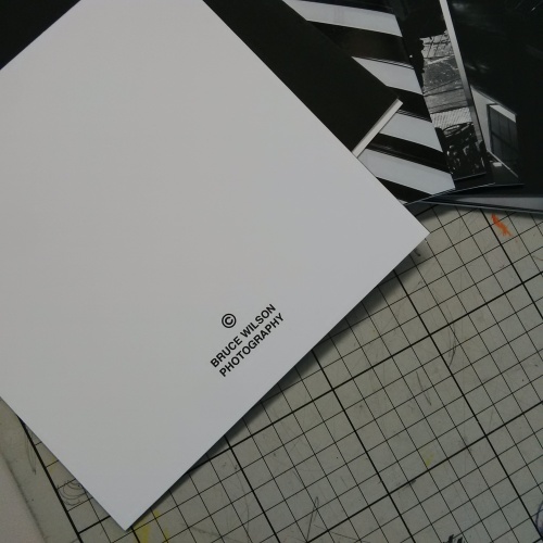
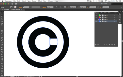
Each card will include a copyright logo on the back. I have created my own logo by simply using a white fill on the inner of two black circular rings. The final effect is neat and sharp, fitting with the other work.

Photographic Cards

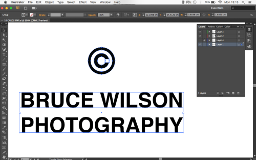
Below the copyright logo is where the client/photographers name is placed. I am using my own name as the example name, as with on the other pieces of my project.

Photographic Cards

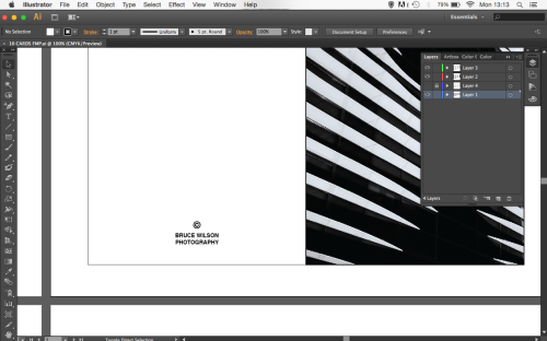
Above you can see more clearly where the photographers name and the copyright logo is situated.

The positioning is neat and clear in the traditional place for such pieces of information on a card.

Photographic Cards

As I zoom out on the artboards you can see that the same format and template is used for each, with just the image being changed. I have also included a nice neat black border on each image to frame the photographs and give a nicely rounded finish to the work.

Photographic Cards

The little black border on each card gives me cutting guidance and a slight room for margin when using a guillotine to cute the cards after printing. I have made the black border one pt size larger than I actually want it to appear, and will cut through the middle to achieve the right finish, with the right thickness border and no white edges that might appear if I was to cut it without this.

Photographic Cards

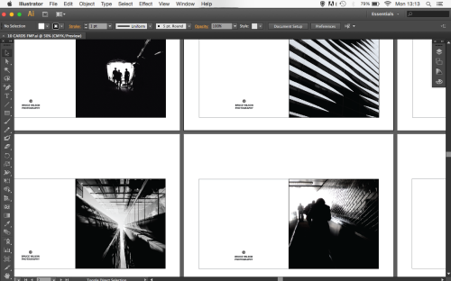
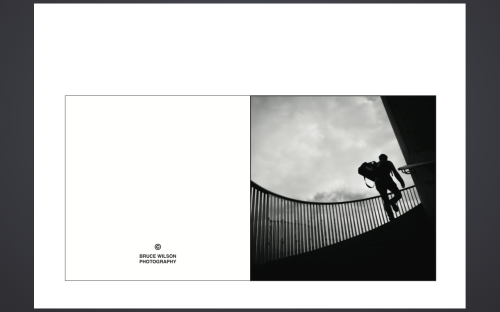
As with the other pieces, I convert the finished Illustrator document to a pdf file and move it onto an external hardrive, ready for the printing process. Above and below are two example pages of the pdf before printing.

Photographic Cards

The Final Printed Photographic Calendar

by brucewilsongraphicdesign

Calendar Calendar Calendar Calendar

Producing The Clients Personal Calendar

by brucewilsongraphicdesign

I started an Adobe Illustrator document to start producing the clients personal calendar.

Personal Calander

The first stage to to decide upon the 13 images needed, 12 for each month of the year, and a cover photograph for the front card. After deciding upon the images I simply drag and drop from the iPhoto folder in which they are collated. Above you can see one image being inserted.

Personal Calander

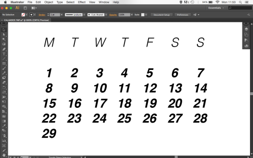
The design I decided upon for the calendar consists of 13 cards or tiles, the 12 monthly tiles all include a list of the dates for each day. I have created this simple chart, shown above, to display the days.

Helvetica, is again used as the typeface, to keep the work clean and neat, two different font weighs have however been used for added emphasis on the numbers. I feel this is simple, neat and stylish.

Personal Calander

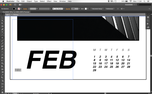
After producing the format for the dates, which will stay the same throughout the cards, I move onto the form for the title of each month. After my research stage I decided upon using just the first three letters of the months name, as it seemed punchier and more edgy perhaps.

A very large oblique helvetica font is used, allowing the height of the letters to match the height of the numerical calendar dates. This maintains a sense of neatness and uniformity that appeals to me.

Personal Calander

Above you can see the final look of the bottom of the card for February.

I have chosen to keep the text black for the continuation of the black and white theme that runs throughout my project.

Personal Calander

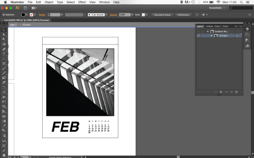
This zoomed out screenshot above shows the card in full. You can see that at the top of the card there is a thin rectangular shape that will be used as the tab for the cards to be glued together, a perforation will be used to allow the client to tear off each card after each month.

Personal Calander

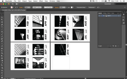
Above is an image of the Illustrator file, with the 4 A3 artboards there to see.

I will now convert this to pdf format, where it can then be moved onto an external hardrive for printing.

Personal Calander

Here is the pdf file, ready for printing to begin. Months January to April.

Personal Calander

Continuing, months May to August.

Personal Calander

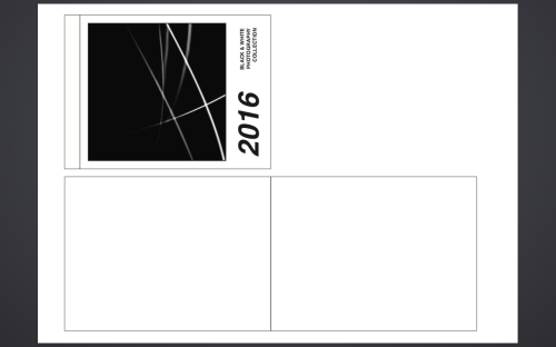
This final page of the pdf file includes two blank rectangles that will be cut and folded to form the back of the calendar, which will fold out to allow the client to have the piece standing up if they choose to.

I will add a small folding tab, which will be glued to the stand, allowed it to stand up, like an A frame.

Personal Calander

Final Printed Photographic Book

by brucewilsongraphicdesign

Once the book was completed and I had a virtual copy to be able to flick through the pages and get a feel for the flow of it and how it all comes together as a package I used Blurb to get it printed.

Blurb is a self-publishing platform that enables their customers to create, self-publish, promote, share, and sell their own print and virtual ebooks, I used them to make my own photographic book.

Photographic Book

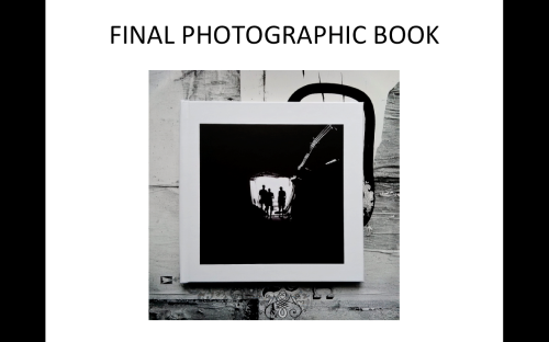
Above, you can see a photograph of the printed book. I am very impressed by the quality of the printing and and high standards from the quality of the paper to the binding of the spine.

Now that this book is printed I use it as the base size for the rest of the packs.

Producing The Photographic Book

by brucewilsongraphicdesign

Once I had collated the images for the photographic book, I transferred them onto my iPad, where there are a series of apps available to mock up the format and structure for the book.

I have used the app ‘My Books’ to produce the virtual prototype of my book.

Photographic Book

As you can see with the image above, the app allows an image from the iPad that I am using to be inserted into the page of the virtual book.

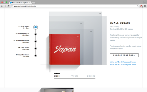
The dimensions of the book are measured to those of the size that my final printed book will be. I will be printing it using Blurb, so I have decided to go for the ‘Small Square’ option.

Photographic Book

The images for the book have all been edited to be in a square format, so it is a simple process of dragging and stretching to position the image centrally. The size of the images will be completely uniform throughout the book. To insure they stay the same I insert a single line black box to each page, with the dimensions the image must be, and drag each image to fit this outline before deleting it.

Photographic Book


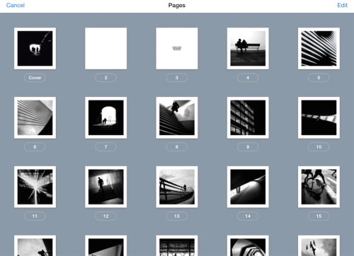
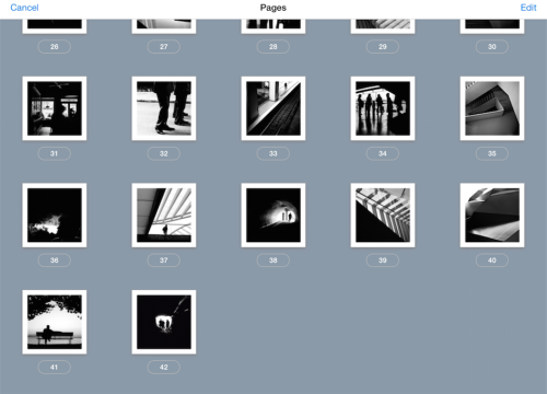
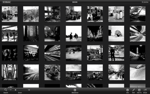
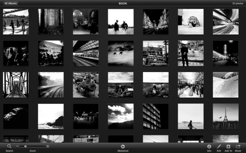
Above is a screenshot of the books pages laid out and numbered, this demonstrates the uniformity of the images an allows me to change the order of the images easily depending on how I feel that they ‘flow’ as a collection.

For example, I wouldn’t want two or three architectural images in a row or two nature related images back to back, and so on.

Photographic Book

 Having the ability to do this sound enhance the overall effectiveness of the book allowing the reader to almost get a sense of walking through a collection that has a certain flow and feel to it.

Photographic Book

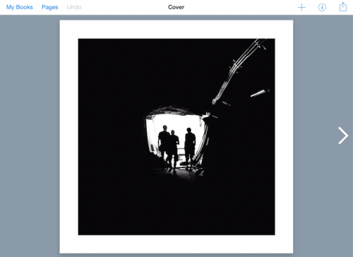
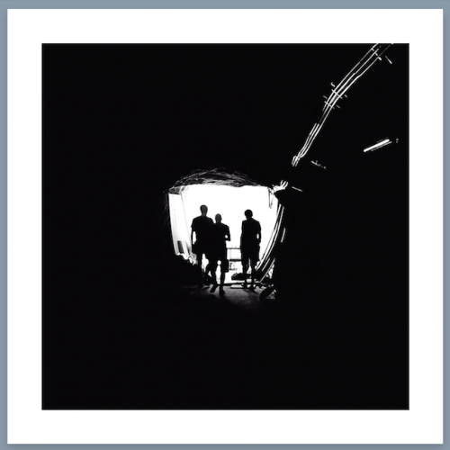
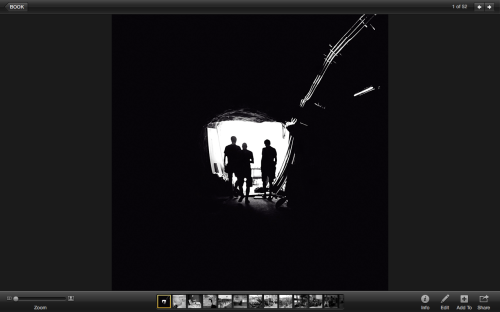
Above is a screenshot from my iPad, this will be the cover of the book, with a large expansive image used rather than any text. This will allow for me to design a sleeve for the book, that will hold the information such as the photographer and the title (if there is one) of the author.

Photographic Book

Final Set Of Images – A Sample

by brucewilsongraphicdesign

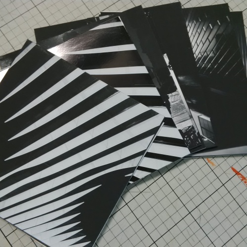
Here is a sample selection of images that I have compiled and edited to become the basis of both prototype packs that I am going to make. I have used Adobe Illustrator and Adobe Photoshop to retouch each of the images allowing them to look more uniform and complete as set, working in harmony.

Photographic Book

Photographic Book

Photographic Book

Photographic Book

Photographic Book

Photographic Book

Photographic Book

Photographic Book

Producing A Set Of ‘Clients’ Images

by brucewilsongraphicdesign

After narrowing down the images that I am going to use I move onto editing and organising 4o into a set. This process has been very time consuming but the final effect should be worth it as the photographs are the basis of my final prototype.

Photo Editorial

For this to work, the 40 images need to look at though they are from the same photographer. For this to be successful they need to be the same style, colour scheme, subject matter, editing style etc.

Photo Editorial

I have chosen a selection of images that do not require too much editing to give them the similar appearance to make them look like they are from the same photographer.

The photographs that need more work are moved into Adobe Photoshop where I can make alterations and more complex changes if required.

Most of the images however can be edited in iPhoto itself. I change the contrast, brightness and slightly improve the sharpness of the image in some cases.

I also go in with the retouch tool and remove any speckles and inconsistencies that I want to remove.

Photo Editorial

Above you can see the final result of this process. The image is clean with good balances and any imperfections removed. Once all 40 images have been complied and edited I can move onto the next stage of designing and ordering the book and the other items.

Compiling A Set Of Example Photographs

by brucewilsongraphicdesign

I started by collating a selection of black and white images that are completely free to use.

The purpose of this is to produce a set of images to act as an example of the set of photographs a virtual client would send in to my company for their photographic pack to be made from.

Photo


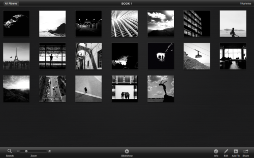
Above is one of the many albums I made in iPhoto to start the long process of collating and sorting a large number to photographs to work towards a final 39 that will make the printed book.

Photo

 This program works well and allows me to work easily between my iPad and Mac, letting me work at times where sitting down at a laptop might not have been possible. On public transport, or just when relaxing doing other things, for example.

It took numerous albums to finally start working towards a final selection, with themes and styles being narrowed down each time. I want all the images to work well together and flow as a coherent piece of work.

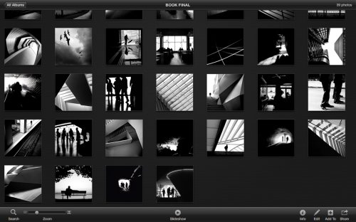
Photo

Above you can see the final selection of images taking shape. These photographs will be taken forward and edited, altered and organised before final designs on the book and the other packs can take shape.

Research Calanders

by brucewilsongraphicdesign

One of the important pieces of the ‘Personal’ gift pack, is the calendar. The client/photographers own photographs will be used for each month of the character. It is very important that I research into some interesting calendar designs and styles for inspiration for my own initial ideas.

Calendars

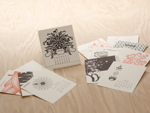
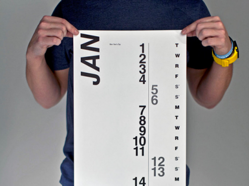
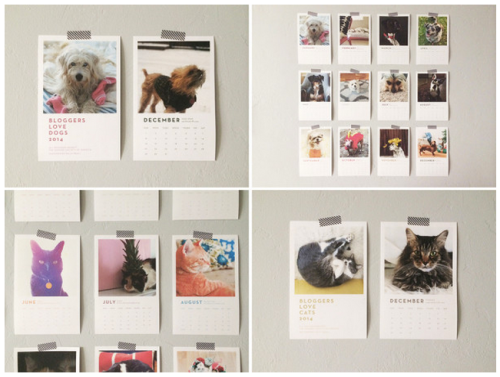
I like this calendar design, there is a nice folded stand for each of the monthly cards, which is something thats effective and striking. The cards themselves feature a simple grid for the dates of the month, the location of the grid moves depending on the image used for that particular month.

There is a large portion of the cards space given to the image, something which I will definitely look to replicate with my own final design.

However, the images on these cards are less ridged and structured than images that I aim to use, with the freeform nature of the images creating a difference in layout from card to card. I aim to make my cards more uniform and simplistic in design, to suit the rest of the gift pack.

Calendar

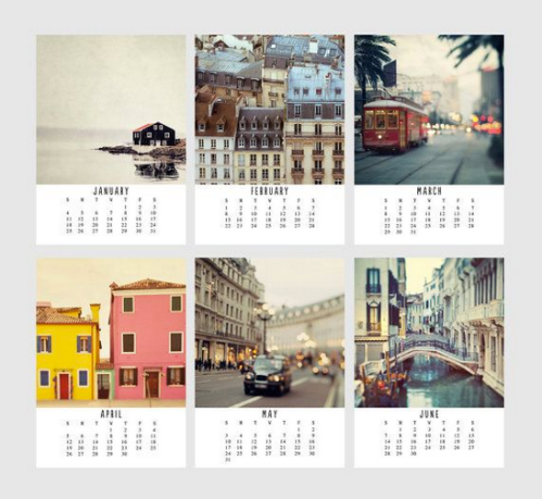
This is another good example of a set of calendar cards, one for each month of the year. I have included this design as an example of a layout where the image is very prominent filling the top 2/3rd of the card.

The grid for the days of the month feels slightly awkward and the title for each month is pushed up too close to the image. This detracts from the overall feel of the piece and something I need to highlight to avoid the same mistakes with my own work.

 Calendars

I wanted to include this calendar in my research as an example of something more abstract and unique on a design level. There are no images included in this piece, but if I could incorporate my clients images around a more interesting and graphically challenging design, this could be something to look at when it comes to the design stage.

 Calendars

I feel the best way to use the photographers images and present them most effectively will be with the layout that positions the images at the top of the card with the most space.

After settling on this layout and design the next thing for me to decide on is how the calendar will be presented.

The first image I looked at used a fold out stand, that could be an interesting addition to the monthly cards, and something that could test my practical design skills.

Above the monthly cards are much less ridged and able to be stuck wherever the client needs though little adhesive stickers, this makes them easier to move around and to fit the clients particular needs.

Calendars

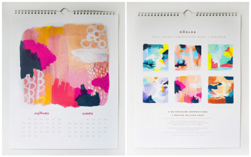
Above the monthly cards are bound together in a traditional fashion that will allow the user to turn over the images at the start of each month. This keeps the calendar all in one place, and the hook allows the client to fix it to a wall or office space, wherever appropriate.

Again, the images and colours are very nice with this design. The difference from the other examples that I have looked at is that this calendar has one image for every two months, as opposed to the traditional one for every month of the year.

I feel, when it comes to my own design, that I will stick with the traditional form, as it will allow twice as much space for the photographers images to be presented. It is good however, to see how well this alternative does work if time constraints mean I need to change tact.

Calendars

I like the idea of the monthly cards being separate from each other, allowing the user to distribute them how they wish or attach them wherever need be. If I am to go ahead with this way of presenting the calendar then I will need to house the cards in some form.

They could be kept loose in some form of cardboard indent in the gift pack, but I feel it would be much more effective if they were presented in a purpose designed and constructed cardboard box.

This will allow for greater scope for a design to test my graphical skills.

Calendars

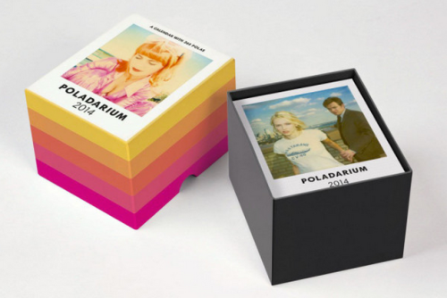
As with the box in the image above, this box features a lid that slots over the pack, housing the monthly cards. The semi circular cut out on the side of the lid allows for ease of removal by the user.

These boxes package the calendar perfectly and I feel the extra work and attention in the design will further add to the power and impact of the calendar cards, as well as work as an effective personal parcel for the client to keep and collate the cards.

Final Pack Items – Personal

by brucewilsongraphicdesign

After my brainstorming I have compiled a final list of the items that will be included in the final Personal pack for the photographer. This of course, can be altered at a later date if need be.

Personal

The final list of items included in the packaging is as follows:

Photographic Book – Produced from clients photographs & a custom designed sleeve.

Selection of Cards – With the clients images used, for family and friends, with messages, in box or sleeve.

Calendar Pack – Produced using the customers photographs, with a sleeve or box to house it.

Diary Style Notebook – With personalised details and the clients photographs, with sleeve.

Final Pack Items – Professional

by brucewilsongraphicdesign

After my professional brainstorming I have compiled a final list of the items that will be included in the final Professional pack for the photographer and client. This of course, can be altered at a later date if need be, depending on the time left to complete the work etc.

Professional

The final list of items included in the packaging is as follows:

Photographic Book – Produced from clients photographs & a custom designed sleeve.

Selection of Handouts – With the clients images used, for employers and associates, in box or with sleeve.

Curriculum Vitae Template – With personalised details and the clients photographs, with sleeve.

Research – Professional & Personal Pack Items

by brucewilsongraphicdesign

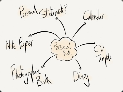
This stage of my research will be initial brainstorms into the potential items that could be included in both the personal and professional packs for the photographer clients.

Professional Pack Brainstorm

Professional Pack

The items in the ‘Professional’ pack will be tailored towards job interviews, and portfolio presentations.

Therefore this selection of possible design items to be included feels appropriate.

The letterheads, business cards and C.V templates will come in very handy were the client to take the package to a job interview, for example.

Personal Pack Brainstorm

Personal Pack

The items in the ‘Personal’ pack will be tailored towards the client themselves, as an individual, with the items being for use personally and perhaps for their family and friends aswell.

The photographic book will be the same as with professional pack, but items like the diary, note pad, calendar etc will be very useful around the house for the client and the personalised items will be what the customer is paying the money for.

The next stage will be for me to finalise the items that will go into each pack and begin the research into each before starting initial designs of these items.

Research – Photographic Book

by brucewilsongraphicdesign

As I have outlined, a photographic booked, created from the personal images sent in by the client will form the centre of both the gift packs that I am producing.

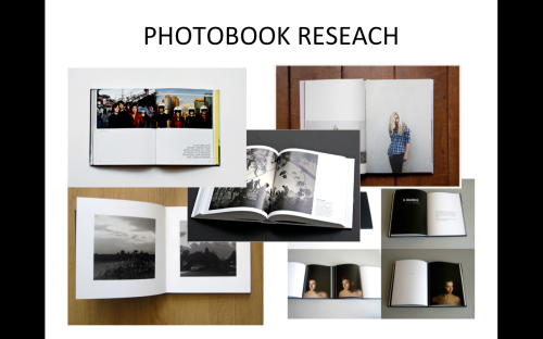
It is therefore very important that I research into photographic books to springboard some good ideas on the style, size, and appearance of the book.

Photography Book

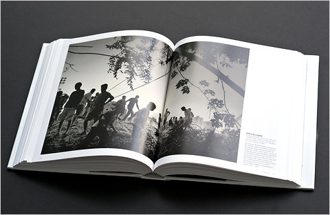
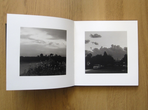
This photographic books double page spread presents two images full width in the top half of both pages.

The pages are neatly numbered in the bottom corners and text is included in the white pages below the image on the right hand page. This is an edgy layout and something that may not lend itself to every amateur photographers style.

Photography Book Photography Book Photography Book Photography Book

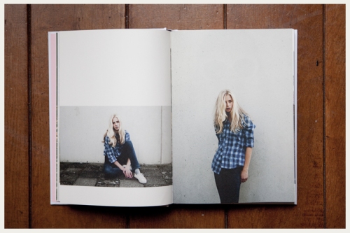
This example above is my favourite and I feel, the most effective layout to present the clients images.

The neutral look of the pages allows for different types and styles of images to fit into the theme without the risk of any clashes.

Research – Giftpacks

by brucewilsongraphicdesign

I need to do some research into gift boxes and the style of box that I could produce for my final piece. Not only will I researching the style, but also the materials used the finish and any additional touches included.

Gift Box

This large rectangular box presents the items alongside each other so that the person opening it can see the contents immediately. This gives a fantastic first impression and adds that wow factor.

Gift Box

Wooden boxes have always appealed to me and as a way of packaging a high end quality product it is quite hard to look past it as a good idea.

The box above have a very nice sliding lid with a groove cut into the wood to that it can be slid open by the user. This is the style of box that I will use if I choose to package my work this way.

Gift Box

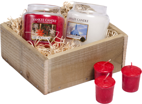
This is an example of a box being used to house Yankee candles, a more rustic approach is used, to work well with the product it is presenting. Wood shaving fill the box to protect the items and to add that extra nice touch for the customers.

Research – Companies

by brucewilsongraphicdesign

Vistaprint

Vistaprint is a very well known global online supplier of printed and promotional material aswell marketing services to businesses and consumers, specialising in print with demand products.

I will be researching into the printed materials the company offers, with both personal and professional examples. The company produces the items that I will be including in my packs for the photographers.

It is the bespoke combination of these items tailored with the clients own work that will set apart my work from the service Vistaprint provides.

Vistaprint

This is the homepage for the Vistaprint website. The page is neat and clean with an effective colour scheme and a large emphasis on the promotional offers the company advertises.

Vistaprint

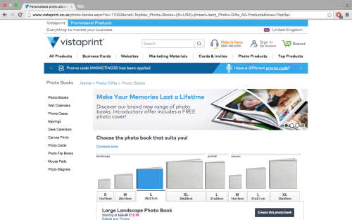
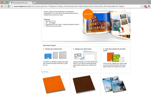
Vistaprint offers the same photo book service that provides the book that I will be creating for my photographer client. There are a range of options available to make the book more personal.

Vistaprint Vistaprint

Blurb

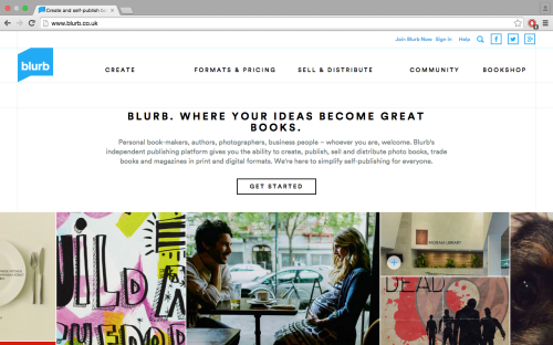
Blurb

This is the homepage of Blurb. Blurb is a self-publishing platform that enables their customers to create, self-publish, promote, share, and sell their own print and virtual ebooks.

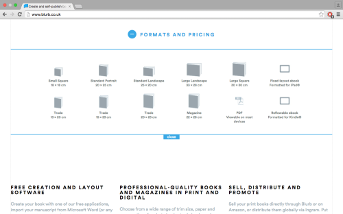
Blurb Blurb Blurb

I will be using Blurb to produce the photographic book that I plan to create to demonstrate the gift pack for my clients. As with Vistaprint, Blurb offers a fantastic service for the individual items, in the case of Blurb, particularly printed books and eBooks.

However they do not offer the gift pack that I will be producing, this is further confirmation of the gap in the market, missed by these large global companies, that I am targeting.

Production Plan

by brucewilsongraphicdesign

FMP – Proposal

by brucewilsongraphicdesign

What:

A gift pack produced by a company for photographers that have sent in a collection of their own photographs.

There may be two options for the pack that the client receives, ‘Professional’ for use at interviews and portfolio showings for example. The items in the pack will be professionally based, with things such as business cards, promotional leaflets, hand-outs etc.

The other possible option will be a pack that is ‘Personal’, with the items included being things such as calendars, diaries, birthday cards, invites etc.

For both packs the photographs will be collated, sorted and in some cases, edited, before being used for production of a photographic book, which will be the main piece in the packs.

The other items in the pack will depend on the possible choice of either ‘Professional’ or ‘Personal’, with custom options available:

Calendar – The photographers pictures will be used to create a personalised calendar, with 12 photographs being selected, one for each month. The client will have the option of whether to choose the images used, or allow the creator of the pack to compile them.

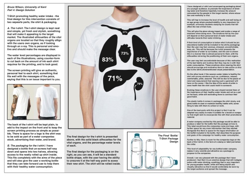
T-shirt – A screen-printed design from one of the photographer’s pictures, again the client can choose what image is used.

 Promotional Cards – For the photographer’s personal use, a set of cards featuring their images, to advertise themselves and their work.

C.V’s – A handout card with the clients curriculum vitae and one image example of their photography work. For use at job interviews or client meetings for example.

Business Cards – Personal business cards or business cards for the clients business or brand, this is at their discretion. Clients image used for front of the business card.

Greetings Card – Possibly most suitable for the personal pack, using the clients photography, probably left blank to allow for more uses.

Why: 

The pack will test a large number of my design and practical skills. Each piece of both of the two packs will have to be designed, and my practical skills will be tested when producing the items.

 How: 

The pack would be produced in two parts, the professional and personal, or as one ‘combination’ pack that combines both items into one box.

The professional pack will be a stripped down version of the personal pack tailored towards job interviews and portfolio showings.

The specific outcomes that I intend to produce are: 

One large or two smaller example gift packs for the photographer/client. The packs will include items specific to whether the pack is professional or personal.

Design Factory – Final Boards

by brucewilsongraphicdesign

Design Factory 1

Design Factory 2

Design Factory 3

Design Factory 4

Dissertional

by brucewilsongraphicdesign

Bruce Wilson

BA – Top Up

University of Kent

Dissertation

“How does the visual marketing for an Olympic games reflect the contemporary cultural identity of the host nation?”


It is hard to contemplate the scale and size of the stage that athletes find themselves on at an Olympic games. The wall of noise from the roar of the crowd, the pressure of the watching millions at home around the world, the weight of representing your home nation on the shoulders, the culmination of a lifetime of sacrifice and hard work all leading up to one Olympic games, one event, one moment.

With a sporting occasion of this magnitude it is clear to see why each aspect of the games is held in such importance. At the forefront is the visual marketing, with the logos and posters, that are the face of each games, advertising and promoting the event to the worlds media.

To explore how the Olympics become such a huge historic global event and why the marketing is so important, we head to ancient Greece, where the games were founded 3,000 years ago.

From the 8th century B.C. to the 4th century A.D., the games were held every four years in Olympia, located in the Western Peloponnese peninsula, by the city-state of Elis. The games were an integral part of a religious festival staged on the plains at that time, held in honor of the Zeus, King of the Gods.

Continuing for nearly 12 centuries, the Olympics become the most famous of all the games held throughout Greece at this time. Their influence in Olympia was so great that ancient historians began to measure time by the four-year increments in between the Olympic games, which were known as Olympiads.

[Encyclopaedia Britannica,. ‘Olympic Games’. N.p., 2014. Web. 29 Jan. 2015.]

After the Roman Empire conquered Greece in the mid-2nd century B.C., the Games continued, but their standards and quality declined. In 393 A.D. Emperor Theodosius I, a Christian, decreed that all such “pagan cults” be banned, and as a result the religious festivals were stopped, putting an end to the ancient Olympic tradition after nearly 12 centuries.

[Encyclopedia.com,. ‘Olympic Games Facts, Information, Pictures | Articles About Olympic Games’. N.p., 2015. Web. 29 Jan. 2015.]

Eventually, the games would rise again, after another 1,500 years, largely thanks to the work of Baron Pierre de Coubertin (1863-1937) of France. Dedicated to the promotion of physical education, the young baron became inspired by the idea of creating a modern Olympic Games, after visiting the ancient Olympic site. In 1894 he got the approval needed to found the International Olympic Committee (IOC), which would become the governing body of the modern Olympic Games.

[Cartwright, Mark. ‘Olympic Games’. Ancient History Encyclopedia. N.p., 2015. Web. 29 Jan. 2015.]

The first of these modern Olympics were held in Athens, Greece, in 1896. Since then the global sporting event has been held every four years and grown into the worlds foremost sporting competition, demonstrated by 10,568 athletes competing in 302 events in 26 sports at the most recent London 2012 Olympics.

[International Olympic Committee, London 2012 Facts & Figures. International Olympic Committee, 2012. Web. 29 Jan. 2015.]

Every Olympic games is supported by a whole host of visual marketing, for a number of purposes. The main role of the visual marketing being to promote and advertise the games, increasing interest, appeal. A successful marketing campaign behind the games could capture the attention of the public and the media of the world, and in turn increase the financial and political rewards that could follow. Politically, if the marketing is used as a piece of propaganda then the reward could be substantial from delivering a message on such a large scale, due to the audience and the scale of an Olympic game.

An Olympic games is a unique sporting event that captures the imagination of the majority of the world for the duration of the 17-day period it covers. The event is a unification of world’s best athletes and sports stars, coming together to compete. The power and prestige that an Olympic games has globally makes it the world’s foremost sporting competition.

Therefore the visual marketing and media material produced by the host nation plays a crucial role. What exactly is visual marketing? Visual marketing is the discipline studying the relationship between an object or event, the context it is placed in, and its relevant image. Representing a disciplinary link between economy, visual perception laws and cognitive psychology.

The specific pieces of visual marketing that have the most importance, are the posters and the Olympic logos attached to the games. Each Olympics, is held in a different host city, every four years, and a new logo and set of posters are produced for each. However, there is one logo that represents the games in its entirety that is constant throughout each and every games.

This iconic piece of visual marketing that is used by every modern Olympic games is the Olympic rings. The symbol was originally designed by the aforementioned Baron Pierre de Coubertin in 1912, co-founder of the modern Olympic games.

From a design point of view, the specifications for the Olympic flag Pierre de Coubertin wanted to design would have been very difficult. The logo needed to be universally accepted for all the nations involved in the games as well as ensure that it become part of the new Olympic tradition moving forward.

Above is the design that is still in use today. The five interlinking Olympic rings are multicoloured, with each colour representing the five continents where athletes travel from to take part in the sporting competition. The interlocking of the rings symbolize that the games are intended for all nations to be able to come and compete against one another in unity and harmony. This message is strongly political, asking for harmony between all nations, and with the global reach of the design, there is a very large audience that will be subjected to this message.

According to Coubertin, the colour of the rings stand for those colours that appeared on all the national flags that competed in the Olympic games at the time.

[The Olympic Museum,. The Olympic Symbols. 2007. Web. 29 Jan. 2015.]

Upon its initial introduction, Coubertin stated the following in the August, 1912 edition of Olympique magazine:

“…the six colours [including the flag’s white background] thus combined reproduce the colours of all the nations, with no exception. The blue and yellow of Sweden, the blue and white of Greece, the tri-colours of France, England and America, Germany, Belgium, Italy, Hungary, the yellow and red of Spain next to the novelties of Brazil or Australia, with old Japan and new China. Here is truly an international symbol.”

[Esham.io,. ‘The Olympic Colors Problem – Benjamin Esham’. N.p., 2012. Web. 29 Jan. 2015.]

The design of the Olympic flag was first made in 1914 but it was not flown at an Olympic games until 1920, when the games were held in Antwerp, Belgium.

The current view of the International Olympic Committee (IOC) is that the symbol “reinforces the idea” that the Olympic Movement is international and welcomes all countries of the world to join. As can be read in the Olympic charter, the Olympic symbol represents the union of the five regions of the world and the meeting of athletes from throughout the world at the Olympic Games. However, no continent is represented by any specific ring. Prior to 1951, the official handbook stated that each colour corresponded to a particular continent: blue for Europe, yellow for Asia, black for Africa, green for Australia and Oceania and red for the Americas, but his was removed because there was no evidence that Coubertin had intended it.

The flag is still flown at both the winter and summer Olympic events, as testament to success of the design and its longevity, an iconic piece of work that represents everything that is good about the Olympic spirit and the nature of the event.

There are clear political propagandist ideas and influences to the design, with ‘unity’ being the main message of the work. The propaganda being of peace and good will, reinforcing the view that the event is a culmination of both these things.

After evaluating the influences behind the design of the primary Olympic rings logo, the next stage will be to explore the logos and posters representing various specific Olympic games. This will produce more evidence on how the cultural and political influences affect their designs.

Looking at specific case studies, the dates of which have been chosen carefully to also explore the changing role of the artist within the visual marketing, throughout the modern Olympic era, will determine how the visual marketing reflects the cultural identity of the host nation.

Berlin 1936 Olympics

The 10th occurrence of the modern Olympic games was held in Berlin, in 1936, from August 1-16th.

[Olympic.org,. ‘1936 Olympics – Summer Olympic Games | Berlin 1936’. N.p., 2015. Web. 29 Jan. 2015.]

These Olympic games were held in a tense, politically charged atmosphere. The Nazi party had risen to power in 1933, two years after Berlin was awarded the games, and its fascist policies led to international debate about a boycott of the games.

Fearing a mass boycott, the international Olympic committee pressured the German government and received assurances that qualified Jewish athletes would be part of the German team and that the games would not be used as a platform to promote Nazi ideology.

However, the government, headed by Adolf Hitler, routinely failed to deliver on such promises. There was only one athlete of Jewish descent present in the German team, pamphlets and speeches about the natural superiority of the Aryan race were commonplace, and the Reich sports field, a newly constructed sports complex that covered 325 acres and included four stadiums, was draped in Nazi banners and symbols.

[Ushmm.org,. ‘The Nazi Olympics Berlin 1936’. N.p., 2015. Web. 29 Jan. 2015.]

The games was the perfect opportunity for the Nazi party to prove to the world the reality of the master race over various sporting disciplines, as 49 countries were competing bringing with them their assorted media. Nearly, 4,000 athletes competed in 129 events.

It was also the 1936 Berlin Olympics that introduced the torch relay, where the Olympic flame was transported from Greece.

Along with the worlds media the berlin Olympics featured advancements in the coverage it received. It was the first Olympic competition to use telex transmissions of results, and zeppelins were used to quickly transport newsreel footage to other European cities. The games were televised for the first time, transmitted by closed circuit to specially equipped theatres in berlin.

[Historyplace.com,. ‘The History Place – Triumph Of Hitler: The Berlin Olympics’. N.p., 2015. Web. 29 Jan. 2015.]

The extended reach of the media, with coverage like never before, further added to the power of the propaganda and visual marketing throughout the world, making the design of the posters and the logo perhaps more prominent and important than ever before.

Researching the logo for this Olympic games is fascinating due to the political background surrounding the games. The next stage is to explore the affect this has had on the final design, or how the design fits the context.

The logo was created purely by chance, a German painter and graphic artist, Johannes Boehland, who started by designing an emblem containing the five Olympic rings with a superimposed eagle and the Brandenburg Gate, one of the symbols of the city. However, the President of the Games organizing committee, Dr Lewald, was not satisfied with this composition and took the initiative to open the bottom part of the emblem, which turned the design into a bell. Although it was purely by chance that it was created, the symbolism of the figure was immediately recognized.

[Olympic.org,. ‘1936 Olympics – Summer Olympic Games | Berlin 1936 – Emblem’. N.p., 2015. Web. 29 Jan. 2015.]

On the side of the bell is the inscription “Ich rufe die jugend der welt!” (I call the youth of the world). The artist Johannes Boehland, was commissioned to continue designing the emblem on this theme. The definitive emblem was thus composed of the Olympic bell of which can be found the Olympic rings with the German eagle superimposed. As well as the Olympic rings, flame and oath, the bell became one of the strong and omnipresent symbols of the Berlin games.

Visually the logo is very striking, due it its simplicity, and now the Nazi connotations are clear and powerful, almost haunting. The colour being absent from the rings feels cold and harsh, giving a feeling of moving away from the inclusive, bringing people together message that colours were intended to have. There is no element of fun or joy, nothing that represents the celebration of a global sporting event, nothing relating to sporting triumph or the pushing of the human body for physical prowess or superiority.

The feelings that come across are of power, and control, but not in a sporting sense, more of political undertones, with the bell representing a call to arms, a far cry from Olympic logos of more recent times.

It is clear to see the influence that the cultural and political background of the time has had on the design for this logo, with the role of the artist being one that is somewhat limited in terms of expression or artistic and creative freedom. This tends to suggest that the artist is used for their skills to present a certain message or propaganda, as dictated by the government and those in power, rather than be given the freedom to express themselves individually.

The best way to compare and contrast the changing role of the artist is to look at the Berlin logo next to the logo for another German Olympic games, this time held in Munich 1972.

Munich 1972 Olympics –

Munich won its Olympic bid on April 26, 1966, at the 64th IOC session in Rome, Italy, over bids presented by Detroit, Madrid and Montreal.

The 1972 summer Olympics, officially known as the games of the XX Olympiad, was held in Munich, West Germany, from August 26 to September 11, 1972.

[Olympic.org,. ‘1972 Olympics – Summer Olympic Games | Munich 1972’. N.p., 2015. Web. 29 Jan. 2015.]

The sporting nature of the event was largely overshadowed by the Munich massacre in which eleven Israeli athletes and coaches, a West German police officer, and five Black September terrorists were killed.

The 1972 Olympics were the second games to be held in Germany, after the 1936 games in Berlin, which took place under the Nazi regime. The West German government, mindful of the connection, was eager to take the opportunity of the Munich Olympics to present a new, democratic and optimistic Germany to the world.

[TIME.com,. ‘Munich Massacre: Photos From The Terror Attack At The 1972 Olympics | LIFE | TIME.Com’. N.p., 2015. Web. 29 Jan. 2015]

This was most clearly demonstrated by the official motto for the games, “die heiteren spiele”, or “the happy games”. This again shows the social and political opportunities presented by hosting a games to German or whoever the host national may be. With various avenues for a governments propaganda to be put across to their people and the worlds media.

The Olympic park is based on Frei Otto’s plans and after the games became a Munich Landmark. The competition sites, designed by architect Gunther behnisch, included the Olympic swimming hall, the Olympics hall and the Olympic stadium, and an Olympic village very close to the park. The design of the stadium was considered revolutionary, with sweeping canopies of acrylic glass stabilized by metal ropes, used on such a large scale for the first time. However, this time the venues were not draped with Nazi banners, symbols and other propaganda.

Once again the Olympic games required a logo and in Otl Aicher, West Germany had one of the most prominent graphic designers of the 20th century. Aicher, born 13th May 1922, in Ulm, Germany, was appointed lead designer for the Munich games.

[Aicher-otl.com,. ‘Otl Aicher Biography – Infos – Art Market’. N.p., 2015. Web. 29 Jan. 2015.]

As well as graphic design Aicher was an educator and author, renowned for his structural visual systems and typography. In 1948 he started his own design studio in his hometown of Ulm, in1953, along with Inge Scholl and Max Bill, he founded the Ulm School of Design. (Hochschule für Gestaltung).

Iconic visual identities from the school include Braun and Lufthansa, which gives some background to the work they produced previously. It was in the early 1970’s that he led the team to produce the designs for the Munich Olympics.

Aicher, designer and director of the visual conception commission, thought logo for the games was a blue solar logo, the “bright sun”. Representing a crown of rays of light, a design symbolizing the sprit of the Munich games – light, freshness, generosity, expressed by the design ‘radiant Munich’. Otl Aichers project was chosen in spite of a competition whose 2,332 entries were deemed unsatisfactory.

The spiral design with striking black & white and the connotations of sunrays, was not warmly accepted by the public when first presented. Common criticisms were that the logo does not relate to sport and the drive for sporting prowess and greatness. There are no Olympic rings present on the logo and no obvious relevance to Munich, the Olympics or Germany.

[1972municholympics.co.uk,. ‘Otl Aicher 1972 Munich Olympics – Biography’. N.p., 2015. Web. 29 Jan. 2015.]

There may be an element of suggested grace and movement but the logo lacks specific human athleticism, endeavor or inspiration.

With the simple black & white, not the five colours of the Olympic flag, the logo combines fractural, trippy psychedelic style prevalent at the time but also calls in heritage from the modernism, futurism and vortisim, not to forget the aforementioned Bauhaus.

Whilst remaining very German in character, the logo – in these dynamic artistic styles takes inspiration from all around Europe producing an overtly internationalist feel, suggesting that the logo could hint at the turbulent state of flux that West Germany was in at the time.

[Tate,. ‘Bridget Riley, ‘Nataraja’ 1993′. N.p., 2015. Web. 29 Jan. 2015.]

Visually the piece is very comparable in its very distinctive style to the work of Bridget Riley. Riley was born in 1931 at Norwood, London, with her childhood spent in Cornwall and Lincolnshire. She studied at Goldsmiths’ College from 1949 to 1952, and at the Royal College of Art from 1952 to 1955. Riley began painting figure subjects in a semi-impressionist manner, changing to pointillism around 1958, mainly producing landscapes.

In 1960 she evolved a style in which she explored the dynamic potentialities of optical phenomena. These so-called ‘Op-Art’ pieces, working only in black and white and using simple geometric shapes – squares, lines and ovals. Although she investigated many areas of perception, her work, with its emphasis on optical effects was never intended to be an end in itself. It was instinctive, not based on theory but guided by what she saw with her own eyes. Op-art works such as Fall, 1963, produce a disorienting physical effect on the eye.

[Op-art.co.uk,. ‘Bridget Riley | Op-Art.Co.Uk | Op-Art.Co.Uk’. N.p., 2015. Web. 29 Jan. 2015.]

The Olympic logo reflects a lot of traits from artistic movements at that time, as the similarities with Bridget Riley’s work displays.

The logo feels as though there was a brief of key words and an overall message that the government wanted to achieve, with the artist being given more scope for freedom and independence within these boundaries.

Creating something fresh, light, radiant, but having the firm stamp of an artist’s individuality over it. This is very unlike the work for the 1936 Olympic logo where the role of the artist when it came to personal expression was extremely limited.

This contrast shows the changing attitudes towards the role of the artist in society, with scope for that freedom of expression coming into the work, with an overall message from the governing bodies underpinning the piece.

Cultural identity is another key issue that comes into the design of Olympic visual marketing, with such a potentially unifying piece of design a great opportunity to bring people together. Cultural identity is the identity or feeling of belonging to, as part of the self-conception and self-perception to nationality, or even ethnicity, religion, social call and any kind of social group that have its own distinct culture.


“Cultural identity is similar to and overlaps with, identity. The definition being, groups or individuals (by themselves or others) in terms of cultural or subcultural categories (including ethnicity, nationality, language, religion, and gender). In stereotyping, this is framed in terms of difference or otherness.”

Another example of an Olympic host nation where the games has been held more than once is London. Exploring these games will give more evidence into the changing role of the artist and whether political and cultural movements have affected the logo designs. Starting with the 1948 Olympics:

Officially known as the games of the XIV Olympiad, the 1948 summer Olympics, were held in London, England. Held after a 12-year hiatus because of world war 11, these were the first summer Olympics since the 1936 games in Berlin. This was the second occasion that London has hosted the Olympic games, having previously been the venue in 1908.

This was a very interesting time for the Olympics to be held, both culturally and politically. The event came to be known as the austerity games, because of the economic climate and post-war rationing. Due to this, no new venues were built for the games, and athletes were housed in existing accommodation instead of an Olympic village, as they were the 1936-berlin games and the subsequent 1952 games. A record 59 nations were represented by 4,104 athletes over 19 sporting disciplines, again this demonstrates the global reach of the event. This Olympic games was the first to be broadcast on television.

[Olympic.org,. ‘London 1948 Summer Olympics | Olympic Videos, Photos, News’. N.p., 2015. Web. 29 Jan. 2015.]

Germany and Japan were refused permission to participate due to the difficult relationships between the nations post-war, the USSR were invited but chose not to send any athletes.

The Olympic games had not been held in either 1940 or 1944 due to world war 11, and London was called upon at short notice to host them. Despite shortages of essential products due to the rationing, the city rose magnificently to the challenge, a true victory for the austerity games over dark times for the nation.

The logo for the Olympic games is composed of the clock tower of the houses of parliament. The hands of the famous “big ben” are pointing to 4 o’clock, the time at which the opening of the games was planned. In the foreground, the Olympic rings. The games organizing committee wanted a typically English emblem, but one that would have significance not only for the generation of that time, but for future generations as well.

The Olympics returned once again to London in 2012, making it the only city to host the games three times.

The London 2012 games were centered around the Olympic park in East London, which is the site of a number of new sports venues. Up to 180,000 spectators a day entered the park to enjoy the games, making it the principal focus of Olympic activity.

The main venues – the Olympic stadium, aquatics centre, velodrome and BMX circuit, as well as the hockey, handball and basketball arenas – were easily accessible through a network of footbridges and walkways within the park.

The Olympic Village was within walking distance of all the venues in the Park, enhancing the experience for athletes and officials. The use of other prestigious venues – such as Wembley Stadium for football, the All-England Club in Wimbledon for tennis, Lord’s Cricket Ground for archery and Horse Guards Parade for beach volleyball – was also a feature of the London 2012 Olympic and Paralympic Games.

The London 2012 Games included a four-year Cultural Olympiad. It reached a climax with the Olympic Games Opening Ceremony on 27 July 2012, starting a 60-day festival of sport and culture across the UK, as the Olympic and Paralympic spirit crosses the world once again.

Wolff Olins developed the London 2012 logo in 2007, for a controversial fee of £400,000.

Wolff Olins is a brand consultancy, based in London, New York, Dubai and San Francisco. Founded in 1965, it now employs 150 designers, strategists and account managers, and has been part of the Omnicom group since 2001.

[Archive.wolffolins.com,. ‘London 2012 – Wolff Olins’. N.p., 2012. Web. 29 Jan. 2015.]

The company specializes in creating positive social impact for clients, developing brand experiences, creatively led business strategies, and visual identity systems and has worked in sectors including technology, culture, retail, energy & utilities and media.

“We don’t do bland. This is not a bland city. We weren’t going to come to you with a dull or dry corporate logo that will appear on a polo shirt and we’re all gardening in it, in a year’s time.” So said Sebastian Coe in a bid to stem the tide of criticism when the Wolff Olins Olympic logo was launched in 2007. What was extraordinary was not the level of criticism from within the design community but the fury of the press as columnists queued up to rage against the LOCOG machine

“It is unconventionally bold, deliberately spirited and unexpectedly dissonant, echoing London’s qualities of a modern, edgy city,” reads their website. “Containing neither sporting images nor pictures of London landmarks, the emblem shows that the Games are more than London, more than sport…The emblem is designed to be populated, to contain in fills and images, so it is recognizable enough for everyone to feel and be part of London 2012.”

“This is a truly innovative brand logo that graphically captures the essence of the London 2012 Olympic games.” Jacques Rogge, International Olympic Committee President.

[News.bbc.co.uk,. ‘BBC NEWS | UK | Magazine | ‘Oh No’ Logo’. N.p., 2015. Web. 29 Jan. 2015.]

However skeptics have remained – Alice Rawsthorn in the ‘New York Times’ called it “the graphic equivalent of… dad dancing”

“The logo fails the Olympics spirit completely. Its component parts are broken apart, while the Olympics are all about athletes, spectators and nations joining together.” Jonathan Glancey

Another crucial piece of visual marketing for any Olympic games is the poster or posters produced. The posters

This is the poster for the 1948 London Olympics.

The connotations of this work are very clear and defined, in the time of austerity after the war, this poster is a unification of the coming together of the nation through tough times. This work is a very clear continuation of the themes presented in the logo.

The houses of parliament are still present with the rings sat in front of them, in the most prominent position.

Colour has been used to help achieve the specifications of the poster, in making it more eye catching and visually appealing than a black and white alternative may have been. The five colours help to show the bringing together of the worlds countries, although Germany and japan were excluded from the competition.

There is a certain power and presence, national pride represented by the houses of parliament. Much like the logo, the governments overriding message is unity and strength though difficult times.

[Encyclopedia Britannica,. ‘London 1948 Olympic Games’. N.p., 2014. Web. 29 Jan. 2015.]

The statue of a discus-throwing athlete brings in the sporting themes to the poster, an icon of physical strength and power, something that is of course extremely important at any Olympic games.

The blue shows the sky above the houses of parliament, perhaps representing that a bright future lies ahead, that better times are coming to the country.

The blue fades out and the bottom of the poster is left clear to highlight the information, the location of the games, and the year and date in which the games is held.

As with the logo for this Olympic games the role of the artist is very limited, there is next to no individual artistic expression. The economic and post-war political landscape in the United Kingdom at the time meant that the message of the logo and the poster was very important. Due to this being the first games to be held since the war. The logo and the poster for an Olympic games is a unique platform for a nations government to put across their propaganda to the worlds media.

The visual marketing works for the 2012 Olympics are a move away from the very specific, stringent, design briefs that artists from pervious Olympics had to follow. The artwork is more about the artist or designer with a strong emphasis being on their individual creative skill and imagination within the umbrella of a wider theme that is trying to be achieved.

“A selection of renowned artists were commissioned to produce a series of posters for the Olympic games.

Posters for next year’s Olympics and Paralympics will be designed by top British artists including Howard Hodgkin, Bridget Riley, Tracey Emin and Chris Ofili, it was announced.

The 12 commissioned artists were named to coincide with the one-year countdown to next year’s London 2012 festival – part of the Cultural Olympiad celebrations.

Among those on the panel that whittled more than 100 names from the art world down to 12 was the Tate’s director, Sir Nicholas Serota, who predicted “colour, vitality, energy and diversity” in the 2012 posters that will be seen all over the capital next year.

Six male and six female artists have been chosen. The others asked to create a piece were Fiona Banner, Michael Craig-Martin, Martin Creed, Anthea Hamilton, Gary Hume, Sarah Morris, Bob and Roberta Smith and Rachel Whiteread.”

[Brown, Mark. ‘Top British Artists To Design 2012 Olympics Posters’. the Guardian. N.p., 2011. Web. 29 Jan. 2015.]

Looking at an example of the posters commissioned for the London games will give a good insight into the relationship between the movements and political landscape at the time and the artwork produced, and as to whether this had any impact on the design or the role of the artist in producing it.

Tracey Emin, (born 3 July 1963) is an English artist, who emerged in the 1980s, during the “Young British Artists” movement. She is noted for her provocative and controversial pieces, including “Everyone I Have Ever Slept With 1963-1995”, “My Bed” and “The Last Thing I Said To You Is Don’t Leave Me Here”

Emin was inducted into the Royal Academy of Arts in London, and in 2011, one year before the London Olympic games, she was appointed as a professor of drawing, demonstrating the power and prestige that she is held in amongst the art community.

Her pedigree is clear, and she will have been commissioned to create something in her style with a very limited brief, to allow her own creativity and unique style to come through. Creating an artwork that is abstract and not dictated to by the governing body at the time. Holding back an artist of this standing with stringent design restrictions would have been wrong, and was something that has been avoided by the British government and their Olympic team.

[Emin, Tracey. ‘Biography – Tracey Emin Studio’. Traceyeminstudio.com. N.p., 2015. Web. 29 Jan. 2015.]

Emin said she was please but surprised to be asked. “The posters are intrinsic to the Olympics, they are the things that are going to stay around,” she added.

She had been sent a book of posters from previous games, she said, but was unlikely to take inspiration from the designs.

“A lot of them are about values which aren’t so important now,” she said. “I’m interested in the party side – the celebration.”

It is interesting that Emin has identified the cultural shift in the values presented by posters for previous games, this is more evidence to support the theory that over time the role of the visual marketing has become less of a platform for propaganda.

Although there is an interesting debate to had as to whether giving the artist a looser brief and allowing more individuality in their work, that this is in fact propaganda in itself. Not propaganda of a specific political nature, but more presenting London and Great Britain as a place that

The official line on her final work:

“Always at the centre of her own world, Tracey Emin shares life, beliefs and feelings through her work with compassion and wit. Emin took the Paralympic values of inspiration and determination as the starting point for her print and created what she describes as a ‘love letter’.

Two small birds, delicately perched on branches, appear to kiss beneath the words ‘you inspire me with your determination and I love you’.

The ‘agitos’ floats below them like feathers or leaves falling from the tree. Birds have frequently appeared in Emin’s drawings to symbolise freedom and strength, whilst her use of handwritten text expresses personal thoughts and emotions.

Her print is a charming and tender tribute to the Paralympic games and athletes.”

[Telegraph.co.uk,. ‘The London 2012 Olympics And Paralympics Posters: In Pictures – Telegraph’. N.p., 2015. Web. 29 Jan. 2015.]

A design of such an abstract nature with its gentle motivational message is far from the strong powerful political undertones conveyed in the poster for the 1948 games in London. With both posters being London centric the comparisons are stark and the role the artist has in the piece is dramatically different. This would suggest that because of the much more settled political landscape at the time of the London 2012 Olympics, that the piece was able to be used for a personal expression, celebrating one of the countries best artists, and therefor the work and the influential people that the united kingdom can produce.

Another example of one of the series of posters commissioned for the games is this work by Howard Hodgkin – swimming.

Howard Hodgkin (born 1932) is an English painter, printmaker and collector. His preference was for emotionally charged figurative groupings in which the figures appeared embedded in the matrix of the picture. The often-manic humor helped place Hodgkin in the climate of pop art, although he was not directly associated with the movement.

Having been commissioned by Andy Warhol to produce a poster for the 1984 Sarajevo Games, Hodgkin is the only one of the 12 artists who has experience in this area.

[Tate,. ‘Howard Hodgkin, ‘Rain’ 1984-9′. N.p., 2015. Web. 29 Jan. 2015.]

Hodgkin said he had a pragmatic reason for agreeing to the Olympic commission. “I said yes because I thought it would be nice for a lot of people to see my work,” His enthusiasm for the games was also rather more toned down than some, as he admitted looking for to it “only in so far as there’ll be something else to see on the telly”.

[Brown, Mark. ‘Top British Artists To Design 2012 Olympics Posters’. the Guardian. N.p., 2011. Web. 29 Jan. 2015.]

Hodgkin describes his paintings as representational pictures of emotional situations.

For his Olympic print he created swimming – a deep, swirling mass of blue flooding across the page. In the darkest area of colour the outline of a figure can be made out as if pushing off after a tumble turn. The fluidity of the brushstroke perfectly captures the movement of water and the sensation of swimming.

This is another excellent example of the artist’s personality and character coming through in the work, there is no political or propagandist motives behind the piece, just a beautiful piece of expressionist work that captures the essence of the event it aims to promote.

A more cultural approach is taken; with the works being a more cultural take on the state of the nation, rather than a strictly political one. Conveying a message of cultural, expression, freedom and exciting vibrancy. Ultimately this will be a political choice to take this stance and specifications from the visual marketing, but the relatively quieter political landscape at the time put the governing bodies in the position to make this design decision. At the time of the 1948 games the decision will have been made that there simply was no alternative but to use the reach of the visual marketing to present a strong unifying message to the people of the nation, and the worlds media.

To explore whether this hypothesis, that the role of the artist was bigger and freer due to the quieter political background and landscape at the time, not just the growing movement towards art being about freedom of expression, looking at the posters for two German Olympics will be telling.

This poster is for the 1936 berlin Olympic games. Produced by Dresden artist, Willy Petzold, whose design, an antique bronze head bearing a wreath of victory signifies strength and power, and the strive for sporting prowess. Clear comparisons with the Aryan male that the Nazi party campaigned for are clear due to the fascist movement at the time.

[Olympic.org,. ‘1936 Olympics – Summer Olympic Games | Berlin – Poster 1936’. N.p., 2015. Web. 29 Jan. 2015.]

The statue of the black chariot depicted, is the Brandenburg Gate, which is the only remaining town gate in Berlin, Germany, standing at the western end of the avenue Unter den Linden. It has served as a symbol of both division of Germany and the country’s reunification and today is one of Berlin’s most visited landmarks.

The gate was commissioned by Frederick William II as an entrance to Unter den Linden leading to the Prussian palace. Built in 1788-91 by Carl G. Langhans after the model of the Propylaea in Athens. These ties back to Athens, that home of the modern Olympic Games, made the inclusion of the Brandenburg Gate very appropriate. The gate was used extensively in Nazi propaganda, and a parade was held there on the Adolf Hitler’s ascent to power in 1933.

The propagandist message is very clear with this poster, and the fact that the symbol previously used by the Nazi party to represent German strength and unity is the most prominent aspect of the poster reflects this. The design is very heavily influenced by the political landscape with this poster being a clear example of political propaganda over an artist’s individual creativity.

[Berlin.de,. ‘Brandenburger Tor – Berlin.De’. N.p., 2015. Web. 29 Jan. 2015.]

Comparing and contrasting this poster with a poster from the 1972 Olympics, held in Munich, will allow any changes in the representation of the cultural identity of the national or the role of the artist to be clearly visible.

This is one of a selection of posters produced for the Munich Olympics. Designed by Otl Aicher, designer and director of the visual conception commission for the games. Aicher being a pioneer of graphic design during the 20th Century and creator of the visual identity for the 1972 Munich Olympics has his stamp of identity across all of the visual marketing for the games.

The colour blocking with soft secondary shades layered on top of each other with sparse text is a winning combination. It’s clean, neat, very simple and sophisticated.

This piece is represented of the selection of posters produced by Aicher and his design team. There are strong similarities with the London Olympic posters here. The poster for the 2012 games was a move away from a specific piece of propaganda and more of a statement on the vibrancy and culture of London and the United Kingdom as a host city. This approach to the visual marketing is present with the work for the 1972 Munich Olympics, with the work presenting a move away from the dark shadow cast by the previous games held in Germany and the political events that followed with the Second World War.

[1972municholympics.co.uk,. ‘Otl Aicher 1972 Munich Olympics – Posters – Sports Series’. N.p., 2015. Web. 29 Jan. 2015.]

The work presents a fresh, exciting Germany, looking to the future, with a desire to move away from the dark past that preceded these games. The designs used reflect the cultural identity of Germany and its people with these messages coming strongly through the work.

The role of Otl Aicher, and the artist in general is much greater with this work, expressing the nations changing attitude towards freedom of expression through art and visual platforms. The political landscape being much more settled at the time of this Olympics allowed the governing bodies to make these design decisions, and gave them the opportunity to present a new Germany to the worlds media, without the need for a specific political piece of propaganda.

In summary, political and cultural movements have a huge influence on an Olympics’ visual marketing, and this has affected some of the most iconic logos and posters that the Olympic games have ever seen. There is clear evidence to see that over the course of time, the prominence of the artist growing and the growing role given to them, allowing their individuality and unique artistic talent to come through.

The visual marketing reflects the contemporary cultural identity of the host nation through the messages and artistic choices that are made, as the governing bodies of the host nation dictates these. There is strong evidence to suggest that political landscapes and large political issues, at times of great importance, such as fascist Germany in 1936 or post war Brittan in 1948, affect the design for the visual marketing most dramatically.

At these pivotal times, it is clear that strong dictation has been used by the host national to deliver a clear message and work of propaganda for the governing body, using the global reach of the design to speak to their people and the worlds media.

There is a stark contrast from the designs and pieces produced at these times, to those produced at more settled time politically, such as in London in 2012. When a more creative, artist approach was used to the logo and the posters.

This is most clear to see with the London logo itself, as the design was outsourced to Wolff Olins, where an edgy, interesting and ultimately iconic design was produced by working to an apparently limited design brief, with no overtly propagandist message attached, such as “I call the youth of the world” in the 1936 Berlin logo. The posters for the 2012 games are used as an exhibition of some of the most talented British artists allowing them to express themselves and their own personal emotions and thoughts about the games, as well as the United Kingdom as a host nation.

[Olympic.org,. ‘1936 Olympics – Summer Olympic Games | Berlin 1936’. N.p., 2015. Web. 29 Jan. 2015.]

This is evidence demonstrating how the role of the artist is used to reflect the contemporary cultural identity of the host nation, with a greater scope for individuality, expression and experimentation at times of lessened political tension or hardship, for example. This is the clearest representation of how the political and cultural movements at the time affect the designs for the visual marketing for an Olympic games.

The design decisions for the visual marketing ultimately come from the governing body of the host nation, therefore the conclusions that have to be made are that times of lessened political tension or difficulty allow the governing bodies to be more creative and experimental with the design briefs.

This combined with the growing role of the artist as an individual and the movement towards freedom of expression through art over the years culminate in a clear correlation between the year the games is held in and the role of the artist in reflecting the contemporary cultural identity of the host nation they have been commissioned to produce artwork and pieces of design for.

Depending on the political landscape at the time the visual marketing reflects the cultural identity through a strong propagandist message and piece of design targeting the global reach of the work, or a move towards a more creative, experimental piece of design. Although it will have propagandist undertones, such as presenting the host nation in a way that the governing body would like the worlds media to see them, the visual marketing is offering a view on the host nation through an artists or designers individualistic approach, rather than a specific political statement.

Dissertation Bibliography

by brucewilsongraphicdesign

Bibliography


Encyclopaedia Britannica,. ‘Olympic Games’. N.p., 2014. Web. Jan. 2015.

Encyclopedia.com,. ‘Olympic Games Facts, Information, Pictures | Articles About Olympic Games’. N.p., 2015. Web. Jan. 2015.

Cartwright, Mark. ‘Olympic Games’. Ancient History Encyclopedia. N.p., 2015. Web. Jan. 2015.

International Olympic Committee, London 2012 Facts & Figures. International Olympic Committee, 2012. Web. Jan. 2015.

The Olympic Museum,. The Olympic Symbols. 2007. Web. Jan. 2015.

Esham.io,. ‘The Olympic Colors Problem – Benjamin Esham’. N.p., 2012. Web. Jan. 2015.

Olympic.org,. ‘1936 Olympics – Summer Olympic Games | Berlin 1936’. N.p., 2015. Web. Jan. 2015.

Ushmm.org,. ‘The Nazi Olympics Berlin 1936’. N.p., 2015. Web. 29 Jan. 2015.

[Historyplace.com,. ‘The History Place – Triumph Of Hitler: The Berlin Olympics’. N.p., 2015. Web. Jan. 2015.]

Olympic.org,. ‘1936 Olympics – Summer Olympic Games | Berlin 1936 – Emblem’. N.p., 2015. Web. Jan. 2015.

Olympic.org,. ‘1972 Olympics – Summer Olympic Games | Munich 1972’. N.p., 2015. Web. Jan. 2015.

TIME.com,. ‘Munich Massacre: Photos From The Terror Attack At The 1972 Olympics | LIFE | TIME.Com’. N.p., 2015. Web. Jan. 2015

Aicher-otl.com,. ‘Otl Aicher Biography – Infos – Art Market’. N.p., 2015. Web. Jan. 2015.

1972municholympics.co.uk,. ‘Otl Aicher 1972 Munich Olympics – Biography’. N.p., 2015. Web. Jan. 2015.

Tate,. ‘Bridget Riley, ‘Nataraja’ 1993′. N.p., 2015. Web. Jan. 2015.

Op-art.co.uk,. ‘Bridget Riley | Op-Art.Co.Uk | Op-Art.Co.Uk’. N.p., 2015. Web. Jan. 2015.

Olympic.org,. ‘London 1948 Summer Olympics | Olympic Videos, Photos, News’. N.p., 2015. Web. Jan. 2015.

Archive.wolffolins.com,. ‘London 2012 – Wolff Olins’. N.p., 2012. Web. Jan. 2015.

News.bbc.co.uk,. ‘BBC NEWS | UK | Magazine | ‘Oh No’ Logo’. N.p., 2015. Web. Jan. 2015.

Encyclopedia Britannica,. ‘London 1948 Olympic Games’. N.p., 2014. Web. Jan. 2015.

Brown, Mark. ‘Top British Artists To Design 2012 Olympics Posters’. The Guardian. N.p., 2011. Web. Jan. 2015.

Emin, Tracey. ‘Biography – Tracey Emin Studio’. Traceyeminstudio.com. N.p., 2015. Web. Jan. 2015.

Telegraph.co.uk,. ‘The London 2012 Olympics And Paralympics Posters: In Pictures – Telegraph’. N.p., 2015. Web. Jan. 2015.

Tate,. ‘Howard Hodgkin, ‘Rain’ 1984-9′. N.p., 2015. Web. Jan. 2015.

Brown, Mark. ‘Top British Artists To Design 2012 Olympics Posters’. the Guardian. N.p., 2011. Web. Jan. 2015.

Olympic.org,. ‘1936 Olympics – Summer Olympic Games | Berlin – Poster 1936’. N.p., 2015. Web. Jan. 2015.

Berlin.de,. ‘Brandenburger Tor – Berlin.De’. N.p., 2015. Web. Jan. 2015.

1972municholympics.co.uk,. ‘Otl Aicher 1972 Munich Olympics – Posters – Sports Series’. N.p., 2015. Web. Jan. 2015.

Olympic.org,. ‘1936 Olympics – Summer Olympic Games | Berlin 1936’. N.p., 2015. Web. Jan. 2015.


Image Bibliography

1972municholympics.co.uk,. ‘Otl Aicher 1972 Munich Olympics – Posters – Sports Series’. N.p., 2015. Web. 29 Jan. 2015.

Aicher-otl.com,. ‘Otl Aicher Biography – Infos – Art Market’. N.p., 2015. Web. 29 Jan. 2015.

Archive.wolffolins.com,. ‘London 2012 – Wolff Olins’. N.p., 2012. Web. 29 Jan. 2015.

Encyclopedia Britannica,. ‘Brandenburg Gate | Gateway, Berlin, Germany’. N.p., 2014. Web. 29 Jan. 2015.

Encyclopedia Britannica,. ‘London 1948 Olympic Games’. N.p., 2014. Web. 29 Jan. 2015.

Graphic Fusion,. ‘The Olympic Identity And Brand – Graphic Fusion’. N.p., 2012. Web. 29 Jan. 2015.

Howard-hodgkin.com,. N.p., 2015. Web. 29 Jan. 2015.

Indiannerve.com,. ‘Olympic-Rings-On-White Logo’. N.p., 2015. Web. 29 Jan. 2015.

James Montague, CNN. ‘The Munich Massacre: A Survivor’s Story – CNN.Com’. CNN. N.p., 2015. Web. 29 Jan. 2015.

Madebymadam.com,. ‘Rory Carnegie | Directors | MADAM | Tracy Emin’. N.p., 2015. Web. 29 Jan. 2015.

McNamara, Robert. ‘How A French Aristocrat Founded The Modern Olympics’. About.com Education. N.p., 2015. Web. 29 Jan. 2015.

Npg.org.uk,. ‘National Portrait Gallery – Portrait – NPG X127158; Bridget Riley’. N.p., 2015. Web. 29 Jan. 2015.

Official Canadian Olympic Team Website | Team Canada | 2014 Winter Olympics,. ‘1948 London’. N.p., 2011. Web. 29 Jan. 2015.

Olympic.org,. ‘1936 Olympics – Summer Olympic Games | Berlin 1936’. N.p., 2015. Web. 29 Jan. 2015.

the Guardian,. ‘A Brush With Howard: Inside Hodgkin’s Studio – In Pictures’. N.p., 2014. Web. 29 Jan. 2015.

the Guardian,. ‘Creative Spirit Of The Games: Olympics 2012 Posters – In Pictures’. N.p., 2011. Web. 29 Jan. 2015.

Ushmm.org,. ‘The Nazi Olympics Berlin 1936’. N.p., 2015. Web. 29 Jan. 2015.

Wagner, Juergen. ‘Poster Olympic Games 1936 Berlin’. Olympic-museum.de. N.p., 2015. Web. 29 Jan. 2015.

Village, Inside. ‘Inside The London 2012 Olympic Village – Telegraph’. Telegraph.co.uk. N.p., 2015. Web. 29 Jan. 2015.

Evaluation & Reflection

by brucewilsongraphicdesign

Evaluation and Reflection:

1) Visual Communication:

In what ways does the visual communication/message of the piece meet the needs of the brief?

 The prototype pack that I have produced meets the needs of my brief very well. I was to produce an educational pack for new recruits in the Royal Navy for the MOD.

The pack will be a tool for learning signalling flags, their alphabetical letter and the meaning of each flag.

I was to produce the learning tool, the packaging, instructional leaflet and a leaflet on the historical background.

I feel that I have completed these tasks well, and produced a prototype and a set of designs that will successfully help my target audience become educated in the naval flags that I set out to aide them learn.

In what ways does the visual communication/message of the piece fail to meet the needs of the brief?

What are the strengths of the visual communication? Why?

The simplicity of the design when it came to my flash cards was crucial, so I feel my visual design choices were strong. I used bright bold colours and neat effective typefaces to keep the cards minimalistic, clean and crisp.

What are the weaknesses of the visual communication? Why?

I found after printing my prototype that the signal flag images came out very pixelated after printing. I initially wanted the pixelated effect, but after seeing the printed version I felt it didn’t quite work aesthetically.

This is something that will be addressed and changed come the final printing of my learning package.

In what ways could the piece be mis-read or mis-understood by the audience?

The audience for my learning package is new recruits in the Royal Navy, with the package being a learning tool to help them pick up some of the key facts and skills that they need to learn to help them with their new role in the Navy.

I feel the message and purpose of my piece is very clear. I have included an instructional leaflet on how to use the flashcards, as well as a historical leaflet on the origins of the signalling cards themselves, so I feel the piece would be very hard to mis-read or mis-understand.

In what practical ways could the piece be developed or improved?

The final prototype showed me that the pixelation effect on the illustrated flags doesn’t work.

This will be adjusted before the final printing of the package.

2) Reflection of own working practices:

How was my time keeping?

Certain personal issues affected my time keeping with this project. However, I feel I did well to be able to present a set of designs and a working prototype in time with the deadline.

The issues affecting my time keeping won’t happen again.

How was my analysis of the brief?

The brief was self dictated from a choice of a number of themes, so I already had a strong understanding of the brief before I started any research and design work.

I still kept a printed copy of the brief for reference during the project to keep myself on track, and I feel this really helped the outcome of my final piece.

How was my research?

My research was good, I used a lot of brainstorming to get ideas flowing, and they helped me to start coming up with some strong initial ideas.

I also did some good background research into the recruits that will be using the pack and the MOD and the branch that formed my audience.

After deciding on my audience and the type of thing I wanted to create, I did strong research into what from of learning tool that I was to create.

This lead me to deciding on flash cards, a decision that I feel was a very good one, but which I may not have arrived at without undertaking the research.

How did I draw conclusions from my research?

After my research I wrote up my findings, to help conclude each section and allow me to make my next steps into initial designs and sketches easier.

How did I use research to generate and develop ideas?

The best technique that I used to generate the ideas was brainstorming, it helped produce a large selection of ideas and thoughts that when followed up with further research lead to my final prototype.

How did I use evaluations to help with my ideas generation and development?

I made evaluations after each brainstorm and each set of initial designs and sketches to help me move forward with my development stage. I wrote up conclusions on the good and bad points of each stage and used these points moving forward when I then developed my ideas and designs.

What parts of the project did I enjoy most? Why was this the case?

I enjoyed learning about the Leitner system, something that I had never heard about before. I designed a fold out leaflet for the recruits to use as a reference for learning the system, something that will help the speed at which the flash cards are learnt.

What parts of the project did I enjoy least? Why was this the case?

I found the time keeping very difficult but I have addressed the reasons why and they will not happen again.

Aside from this I enjoyed the project as a whole and producing a pack like this may well come in very useful in the future when I myself need to create a learning tool for something I need to revise.

At what times did I work best? Why might this be the case? 

I worked well under the big pressure of the deadline, and upped the work load to be able to produce a presentation and a working prototype within the time period allocated. I need to ensure that in the future I complete my projects with this work rate to ease the rush towards the final deadline.

What areas inspired me? Why was this the case?

After choosing the theme ‘A-Z’, I started thinking away from the traditional alphabet and after online research I was inspired by the idea of navy flags, morse code and other alphabet related signals and codes.

Any other points?

Obviously time keeping was the biggest issue with this project, however I do feel I have done well to complete a set of designs that meet my brief and a working prototype to draw conclusions from before final printing.

.

by brucewilsongraphicdesign

Final Prototype

by brucewilsongraphicdesign

A-Z Design – Leitner Leaflet

by brucewilsongraphicdesign

After deciding I needed an instructional leaflet for the Leitner system of using the flash cards here is my final design.

The Leitner System Leaflet

Once again with this project, simplicity was key. I have used the clear, clean helvetica typeface to reflect the simplicity of the brief. A coloured diagram is also included for the user to make the instructions even clearer. The leaflet will be folded and kept in the package with the other flash cards.

A-Z Design

by brucewilsongraphicdesign

A-Z

The final designs for the front of the flash cards.

Kept simple again, with bright, bold colours to help make the flags as memorable as possible.

A-Z

A-Z Design

by brucewilsongraphicdesign

The final designs for the backs of the signalling flag flash cards.

A-Z

The bright, bold, eye catching red is used to draw attention to the alphabetical letter associated with the flag, not just the name, and will add to the effectiveness of the card when it comes to learning the meaning of each flag.

A-Z

The meaning of each signal flag is included below the letter. Typefaces are kept to helvetica for simplicity and effectiveness visually.

Initial Design – Packaing

by brucewilsongraphicdesign

The set of cards will be placed on top of a net, forming the bottom piece of the packaging, the sides of which close up around the flash cards, with a lid securing the package when placed over the top.

Packaging

The sides will be the same dimensions as the height and width of the stack of cards, keeping any movement inside the closed package to a minimum.

Packaging

 This sketch shows what the packaging will look like once the sides are folded up around the cards.

This design stops the users having to fit the cards into a box, but allows the box to be fitted around the cards, which pushes them into a uniform pile, making it easy for the lid to be secured once they are stacked neatly.

Flash Card Design

by brucewilsongraphicdesign

Here is my initial design for the flash cards. They will be kept very simple, to aid the learning process as much as possible.

The Front of the Flash Card:

Charlie

The Back of the Flash Card:

Charlie

Flash Card Dimensions

by brucewilsongraphicdesign

After some thought I decided that I wanted my flashcards to be the same size as a traditional playing card. The size will be familiar to users of the pack, and it will be a reliable choice due to the fact that cards are still produced to these dimensions today.

Playing Card

The dimensions of my flashcards will be: 8.9cm x 6.4cm

Research

by brucewilsongraphicdesign

To make a start I need to do some research on the form of learning and revision tool that I will be producing.

One of the main forms for learning flags, signs and something that is often used in learning languages is ‘flash cards’. They are the learning tool that I have chosen to go for.

Flash Cards:

A flash card is a set of cards bearing information, such as words or numbers. In my case the information will be the signalling flags and their meanings for each letter of the alphabet, the numbers 1-10.

One side of the card gives the question with the answer overleaf. Therefor I will have the signal flag one side, and the alphabetical letter and meaning on the reverse.

The user will take each card and view the side with the flag as a prompt and be tested to recall the meaning of the flag, then check the answer by turning the card  over and seeing whats on the reverse of each.

Various systems have been developed for learning using these cards, with one of the main principles being spaced repetition, increasing the review interval whenever a card is recalled correctly.

Manually managing interval length can add greatly to the overhead of using flashcards.

The Leitner system for scheduling flashcards was introduced by German scientific journalist Sebastion Leitner in the 1970’s.

Brief For APP

by brucewilsongraphicdesign

I am to produce an educational pack for new recruits in the Royal Navy for the MOD.

The pack will be a tool for learning signalling flags, their alphabetical letter and the meaning of each flag.

I am to produce the learning tool, the packaging, instructional leaflet and a leaflet on the historical background.

Royal Navy

A to Z

by brucewilsongraphicdesign

A-Z

After doing a little brainstorming on this theme I found a lot of ideas coming to me, with one in particular sticking out.

When I started thinking of the alphabet, I was drawn to the phonetic alphabet, Alpha, Beta, Charlie and so on.

Brainstorming

by brucewilsongraphicdesign

I have started some braining storming to get some ideas on each of the themes flowing, hopefully through this I be able to form a good idea for a product for one of the themes, and I can begin forming a draft brief.
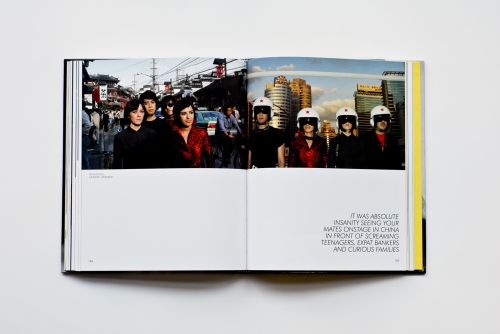
Learning Languages

A-Z

Love Letters

Myth

A La Mode

Anthology

APP – Picking Two Themes

by brucewilsongraphicdesign

I am to pick two themes from the following areas:

Learning Languages

Myth

Love Letters

A la mode

Anthology

A to Z

The first stage is for me to get brain storming with each of the themes to start some ideas flowing.

BA Top-Up

by brucewilsondesign

Dissertation

Final Website Screenshots

by brucewilsongraphicdesign


The Making Of The Website

by brucewilsongraphicdesign


Website Design

by brucewilsongraphicdesign

The Importance Of A Website

by brucewilsongraphicdesign

The next step in my Final Project is to make a start on the website for my t-shirts.

I will start by outlining some of the advantages of having a website:

Promote your physical location, improved customer service and update information easily

Add credibility to your business and keep up with the latest trends and innovation in the industry

Stay ahead of the competition and expand your customer base

Enjoy a more cost effective and versatile approach than traditional marketing

Increase your profits


Social Media – Instagram

by brucewilsongraphicdesign

Instagram is a great way for me to build a group of followers and people interested in the clothing and the brand.

I have set up the Instagram page: @locketclothing

You can see it below:

The gallery below:

This will help build the brand, and as you can see from the number of followers in such a short space of time it has already been a success. I will continue to add to it from time to time.