brucewilsongraphics

Graphic Design, University of Kent

Month: March, 2013

Evaluating My Own Practices

by brucewilsondesign

I am very happy with the seven apps that I have created, however there are a few things that I can defiantly improve when it comes to my own practises. I hadn’t actually started work on any of the final apps until the afternoon before submission date, which obviously isn’t ideal. So I think it is obvious that I need to start work on the final pieces as soon as possible so that anything that happens that prevents me from working isn’t a problem when it comes to final submission.

My analysis of the brief was good, I have learnt from my past mistakes and kept an annotated printed copy with me throughout this project. I feel doing this helped me when it can to choosing specific areas to research and look into. Hopefully doing this has made a difference to the quality of the final work that I have produced, I felt that not doing a full evaluation of the brief has held me back in some of the past projects.

My research was good. The ideas that I came up with all have direct links to the research that I have done, making my final pieces as good as they can be. I found out ideas what worked as well as designs that didn’t work so well, which has helped me produce a better quality of final icon designs.

Experimentation has been a big part of helping me come up with good quality final pieces. The final designs that I had drawn out by hand are almost all completely different from my final pieces. This is due to the experimentation that I have done when starting out designing the icons. For example, the ice cube idea for the thermometer was scraped after seeing that on screen it just didn’t seem to work, and after this, the classic long, thin thermometer idea was also scrapped.

Overall im very pleased and I feel that this project has gone well considering I have never designed an app icon before. Looking forward to the next project now.

Evaluation

by brucewilsondesign

Visual Communication

Explain the visual communication of each of the apps in relation to the brief:

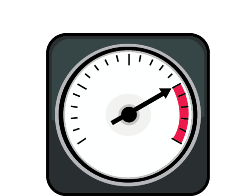
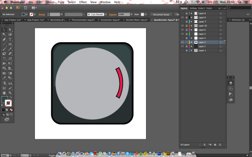
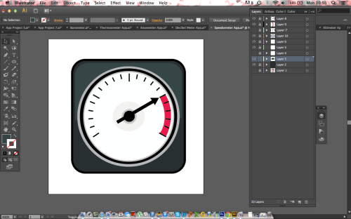
Speedometer – The speedometer communicates very well. When anyone thinks of a speedometer the image they get in their head is of the classic number dial with the arrow that points at the speed that is being registered. This is why I have gone with the design that I have, the icon needs to relate a message to the user every time they see it, so they know its purpose straight away. This icon that I have designed is a simplified version of the classic speedo that everyone knows and recognises. Therefore it works well both in visually communicating a message to the iPhone user, but also at working in a small size and confined space. The colour schemes are nice and bold and help to exaggerate the importance of the speedo by the bright contrasting white dial, which will also help users to quickly notice and then recognise the purpose of the app.

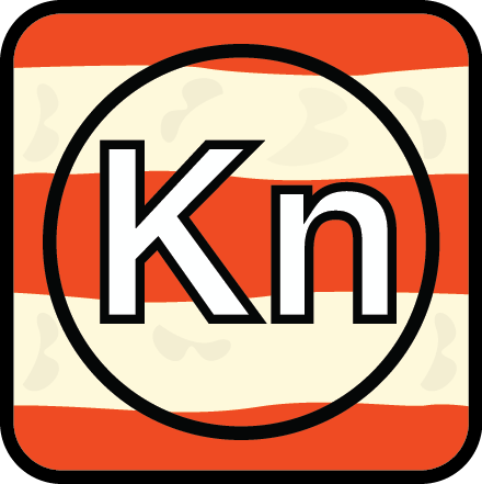
Anemometer – The anemometer was a tricky one but I feel it has turned out well in the end. I started out by designing an icon that used the circular fan at the top of a real anemometer as its center feature but soon found out that this would be too difficult and complex a design to work well in a small box suitable for an iPhone. Therefore I had to change tack and went down a totally different route that I feel has ended up with an icon that communicates the message as well as, if not better than my original idea. I have used an orange and white striped effect to replicate that of a windsock. I thought this was a great idea as the colours make the icon stand out while at the same time being relevant as a wind sock signifying a real life way of judging wind speed. On top of this background I have added ‘Kn’ which is the unit for wind speed, which will again help to make the purpose of the app clear and eye catching to any iPhone users. I feel the icon works very well because of this.

Altimeter – I am particularly happy with the final design that I have come up with for the altimeter, I feel the visual communication is strong and that the icon is easily recognisable for the iPhone user. This idea was a simple one but one that seemed obvious to me. If you do a Google image search on the term altimeter what comes up is a whole host of images depicting altimeter watches and readers, all of which have the same rugged look and style, which is obviously to make them suitable for use up mountains and in the outdoors. I therefore wanted to recreate this dark, rugged style within the small box provided for the icon. The altimeter faces are often very complex with loads of numbers and terms, so it was important that the first step I took was to simplify this right down and strip it back to its bear bones. Once I had done this I produced a really simple yet effective icon that represents the real thing very well, and because of this the user will be able to recognise and find the app easily. This indicates that the visual communication is strong and that it should work very well.

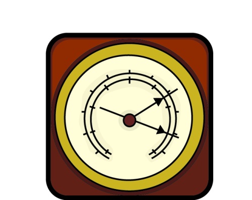
Barometer – The barometer was again a simple choice for me; one that I feel has worked well and communicates the message to the user successfully. I didn’t want to go down the route of using clouds or rain to attempt to communicate that the app was a barometer, but to actually use a simplified app sized version of the real thing. I don’t feel that any other design other that that of a real barometer conveys that it is a barometer anywhere near as clearly. Although the app will have its name underneath the icon, the idea should be to try and make it obvious to the user what the app is without relying on that description. It should work in isolation, something that I feel each of my icons do. I simplified and reproduced a classically styled barometer and used this for my icon, it works well and visually communicates the message effectively.

Decibel Meter – As with all of the icons I have produced I feel that the best way to represent decibel meter, is to show a decibel meter itself. I wanted a really nice classic looking decibel meter, something that was attractive and nicely styled while also conveying and visually communicating to the user that it was a sound measuring device. The creamy white colour works well with the nice deep reds that I have used, I spent a fair amount of time picking a colour scheme that would be eye catching but classy and classic looking at the same time. As with each of the other icons I have reduced all of the numbers and text from the screen, thus making it easier on the eye for the user as well as insuring that it will work at a tiny size. The only type on the icon is ‘Db’ which is positioned in a large size at the bottom of the icon. ‘Db’ clearly stands for decibel and is another good feature that helps to communicate the message of the app to the user. I feel that it works well in doing so.

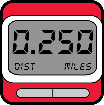
Pedometer – The pedometer was another one that took me a while to come up with an idea that I was confident with. What I have gone for is, once again, a representation of a real life pedometer, as I feel there if no better way of visually communicating the message of the app to the iPhone user. I toyed with the generic idea of using a shoe, for footsteps, but decided against this as without the description of the app below the purpose of the app wouldn’t be clear at all. The app sized version of a real life pedometer works very well. The colours that I have used make the icon stand out and eye catching for the user, something that is very important when the app icon is competing in a crowed iPhone screen. The pedometer is already a simple product, so there was not a lot that I needed to cut down, but even so I feel I have got the balance right and that it works well. This is an idea that I haven’t seen done before, so I’m happy with what I have produced.

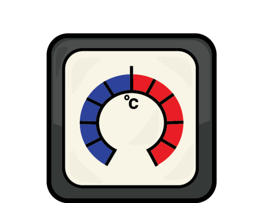
Thermometer – A thermometer is something that is very well known, and almost everyone would know what the app is if the blue and red, hot and cold combination was used effectively. The traditional thermometer is one that is a long, thin glass tube with the rounded section at the bottom. So I wanted to use this style of thermometer, however when it came to creating an effective icon using this type I found it difficult due to the long thin shape fitting the square box. So I went back to the drawing board and found a better version of the thermometer that was circular and I found works very well. I removed all the unnecessary type got rid of numbers and so on, making its simpler to insure that it works well at a small size. The only type is the ‘C’ that’s in the center of the app which will make it clear beyond doubt that the purpose of the app is to measure heat. Therefore I feel that I have succeeded in visually communicating the purpose of the app while also creating a stylish and nicely designed piece of work.
Anemometer

by brucewilsondesign

This is my finished anemometer app icon. The idea was a simple one, to reflect the colour schemes of a wind sock, which is another was of measuring wind speed. The bright orange and the contrasting white will make the icon easily recognisable to the iPhone user.

Anonemter

Kn stands for Knots which is the unit for wind speed. So I thought it works well being big, bold and striking on the center of the app icon.

Decibel Meter

by brucewilsondesign

This is my finished decibel meter app icon. Again, im happy with this. During my research I looked at real life decibel meters and wanted to reflect the actual thing in my own app icon. I have simplified it right down to a form that will work when reduced to the tiny size required by on iPhone screen.

Decibel Meter AppI keep the colour schemes nice and classic to create a really classic looking icon that will defiantly make iPhone owners want to download and use the app. The creamy white and the nice browns and red all work together to give the app just the look that I was after.

Barometer

by brucewilsondesign

This is my finished barometer app icon. I was looking for classically styled app that would reflect a real life barometer and I feel it has worked well. The colours are all chosen to make my illustration mirror that of a real barometer as well as the detail included on the face of the instrument.

Barometer

I obviously had to simplify the face of the barometer, due to the vast amount of numbers and words that are on a real one. This is what I came up with, a really stripped down face, but not unrecognisably so.

Thermometer

by brucewilsondesign

Here is my final thermometer app icon. Once again, it was all about simplifying everything down to get a nice little eye catching icon that will work well at very small sizes. I found a circular style thermometer and used this as the basis of the icon, I found that using a traditional long thin one wasn’t working too well in the square box, which is why I changed to this style of reader.Thermometer App

I went this a nice bold dark grey to frame the reader, with the temperature gage being bright blue & red. This simplified version of a real life thermometer insures that it is recognisable, accurate and will work well at small sizes on the users iPhone. Again, I am happy with this one.

Speedometer

by brucewilsondesign

This is my final finished speedometer. I think this one works very well, the icon is simple but eye catching and easily recognisable at the same time. I used a simplified speedo and reduced it down further by removing the numbers and anything that wasn’t absolutely necessary in my own illustration

Speedometer App


The final effect is an icon that people will instantly recognise and be able to find quickly when they need to on their iPhones. The colours work well, as I tried to keep the icon relatively plain apart from the bright red that will clearly indicate that it is a speedometer app. Happy with this one also,

Altimeter App

by brucewilsondesign

This is one of my favourites of the app icons that I have designed. This icon was designed with a real life altimeter watch or instrument in mind, and made to look as much like the real thing as possible, while at the same time keeping it very simple.

Altimeter App

Almost every single altimeter that I looked at in my research used this colour scheme, so it was an easy choice as far as that was concerned. I layering of shapes was used to recreate the face of the altimeter, and all the numbers and words have been stripped back to ensure that the icon works at tiny sizes. Very happy with this icon also.

Pedometer

by brucewilsondesign

Here is my final pedometer app icon. I followed the same idea as I have done with the other icons, which is do use the space to replicate a real life version of the purpose of the app. So this icon is to represent a pedometer.

Pedometer

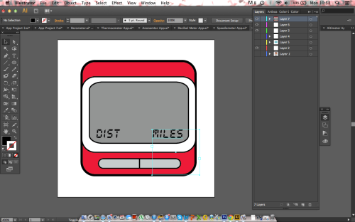
A used a nice red that will draw the users eye towards the icon and make it easy for them to find when in a hurry. The numbers and text a purely to make the icon fit what would be expected of a real life pedometer. The grey screen is realistic, and I managed to make it believable but still simple at the same time. I feel it has worked very well and should get people using the app frequently.

Making My Icons

by brucewilsondesign

App Icon

App Icon

App Icon

App Icon

App Icon

App Icon

App Icon

App Icon

App Icon

App Icon

App Icon

App Icon

App Icon

App Icon

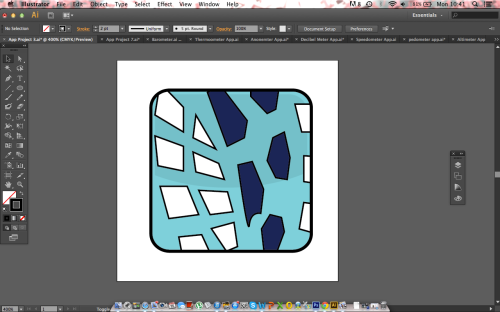
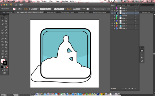
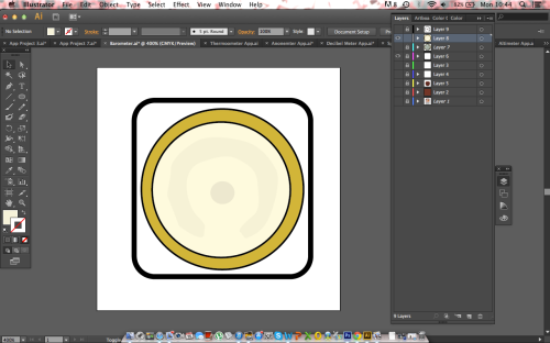
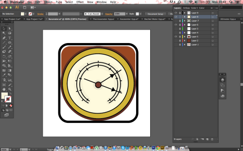
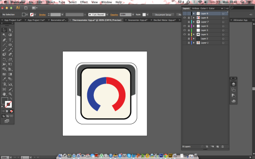
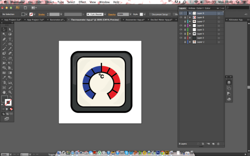
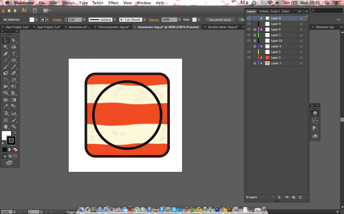
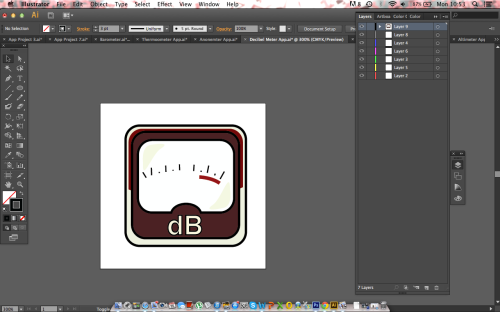
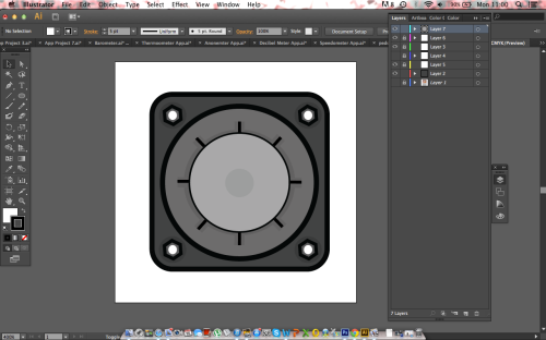
The altimeter was a simple one for me, I wanted to reproduce a real altimeter that a climber or explorer may to use to make sure users can instantly recognize the purpose of the app. The foundations of the icon are the large rounded square that is coloured a deep grey. Above the square will sit the two circular faces of the device with the four screws in the corner. These are done by using the hexagon tool and simply duplicating to make the other three. You can see the faint shadow that is used between the layers to create a more realistic look for my icon, this is done by simply using a slightly darker shade to represent the shadow.

App Icon

Once all the shadow has been added and the majority of the icon has been built up, the final stage is to add the hands and make any adjustments that are needed. Happy with the way this icon is coming along.

Sketched Designs

by brucewilsondesign

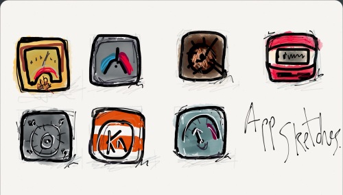
Here are the sketched designs that I will be working to for my final app icons.

Sketches

The order, from top left: Decibel Meter, Thermometer, Barometer, Pedometer, Altimeter, Barometer, Speedometer.

Digital Media

by brucewilsondesign

Digitised content such as text, graphics, audio, and video, that can be transmitted over internet or computer networks.

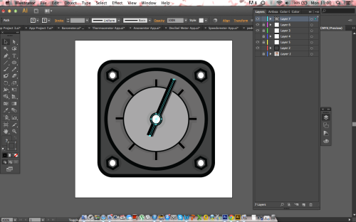
Adobe Creative Suite is a collection of graphic design, video editing, and web development applications made or acquired byAdobe Systems. The collection consists of Adobe’s applications, Photoshop, Illustrator, InDesign and so on. The latest version, Adobe Creative Suite 6 (CS6), was released on May 7, 2012.

Ai

An example of the work that can be produced on Adobe Illustrator.

The creative suit is a key tool in modern design, making it a big part of todays digital media. Anything from postcards and flyers, to apps and eBooks can be designed on the creative suit from any computer anywhere in the world. Making design something that anyone can do, especially as the software used by professionals is available to the general public and therefore a whole host of new designers and people producing todays digital media.

Thermometer

by brucewilsondesign

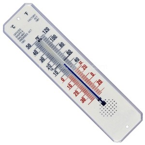
A thermometer is, as everyone knows, a measuring device for temperature. It seems obvious that I should be illustrating a thermometer for the app icon.

Thermometer

This wall mounted thermometer may not be the most traditional style, but it shows the way that the device works. The glass tube is filled with a mercury mix that rises up as the temperate increases. The units for temperature are ‘Degrees Celcius’ and ‘Fahrenheit’ both of which are either side of the glass tube. I think a simplified version of the classic thermometer on top of a colourful square icon will work well.

Thermometer

This example of a thermometer app works pretty well. Although my own apps will have to be square, there are still a few points that I can take from this example. The light blue works well, and will make the app stand out when the user comes to finding the app when he needs to use it. The simplified illustration also works well and solves the issue of having a load of numbers to avoid in the artwork. The shadow is also something that I will consider with my own designs.

Altimeter

by brucewilsondesign

An altimeter is a measuring device for height above or below sea level. Altitude is normally thought of in relation to peaks or mountains and I should therefore look to use a symbol or illustration that relates to a mountain, perhaps a snow topped simple illustration of a peak for the app icon.

The altimeter app will presumably measure the height of the users phone, and therefore the user, above or below sea level.

Seeing as the app measures the user I could use an illustration of a person with water included in the icon, so something along those lines.

Altimeter

This altimeter app is maybe a little to complex for my project, seeing as there are another six apps for me to design. However it does make a good example for my research, the icon has been designed to look hard and solid to replicate the style of a real altimeter that someone may use when in the outdoors. A really nice example of how a more complex icon can still be effective and work well, something to bear in mind.

Anemometer

by brucewilsondesign

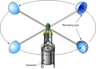
An anemometer is a measuring device for wind speed. The most commonly known form of this instrument is the type that has the three or four cup shapes that capture the wind going past.

Anemometer

This is the style of anemometer that people easily recognise when they think of measuring wind speed, so I feel it would be perfect for me to illustrate and use as a feature for the app’s icon. A simple artwork on a nice colourful background should work well.

App Icon

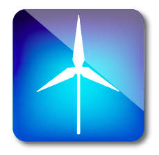
I found this app icon, a really nice simple white illustration has been used to portray the purpose of the app, and so making it easily recognisable for users that want to use the app. A wind turbine wouldn’t quite work when used for a anemometer app but it is good to see a successful use of the simple illustration technique, something that has been very helpful as part of my research.

Pictograms

by brucewilsondesign

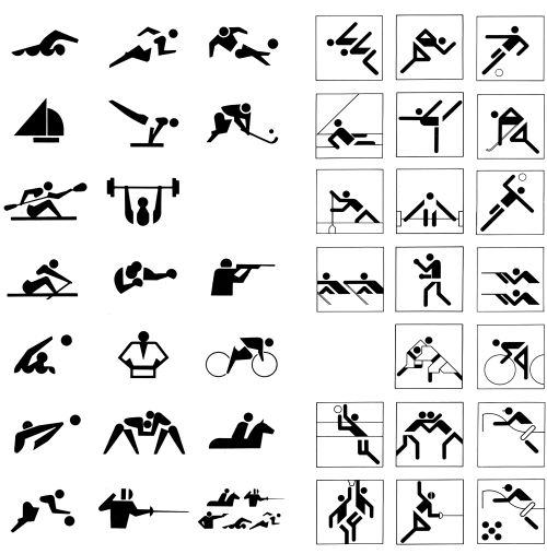
When designing apps, a great place to start my research is by looking at pictograms.

A pictogram, is an symbol that conveys its meaning through its pictorial resemblance to a physical object or action. For example, an image man with a ball would be referring to football. Pictographs are often used in writing and graphic systems in which the characters are to a considerable extent pictorial in appearance.

Pictography is a form of writing which uses representational, pictorial drawings. It is hieroglyphic writing that also comes to mind when thinking about pictograms, which also uses drawings as letters or phrases.

Pictograms

I have picked out these pictograms are they are an example of some of the best that have ever been produced. The set on the left are the Tokyo 1964 series by Artistic director: Masaru Katzumie & Graphic designer: Yoshiro Yamashita. The set on the right are Otl Aicher’s from Munich 1972.

Otl Aicher’s olympic pictograms are one of the cultural mile-stones in the field of visual communication, the design was so successful that it articulated to multi-lingual and mutli-cultural audiences which had never been done so well before. The pictogram system which was devised by Aicher and his team for the games was the perfect example of simplistic information design and has now become the universal standard.

They will defiantly be a great source of inspiration for my own app designs, making it clear to me that the simpler the better. Overcomplicating the designs is something that I must not let happen.

Barometer

by brucewilsondesign

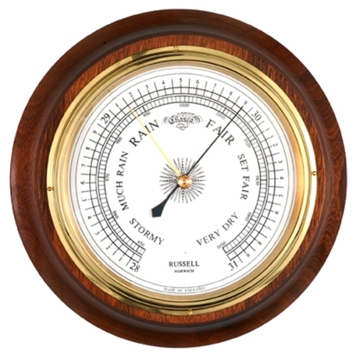
A barometer is a measuring device for atmospheric pressure. The iPhone app will detect the amount of pressure and present this information to the user. Once again it is a number dial that first springs to mind as a icon to indicate the function of the app. I will work along these lines when starting to come up with my own ideas, a dial or generic barometer type icon. A old fashioned wooden barometer may be something to have a look into.

Barometer

This traditional barometer is a perfect shape for being placed onto the rounded square of an iPhone app. I could make simple illustration of it and place this onto a pre designed background.

Decibel Meter

by brucewilsondesign

 A decibel meter is a measuring device for sound, which is measured by the unit ‘decibels’, the iPhone will detect the amount of noise and present this information to the user via a decibel reading. Therefore, once again it is a number dial that first springs to mind as a icon to indicate the function of the app. I will work along these lines when starting to  come up with my own ideas, a dial or generic measuring type icon.

Decibel Metre

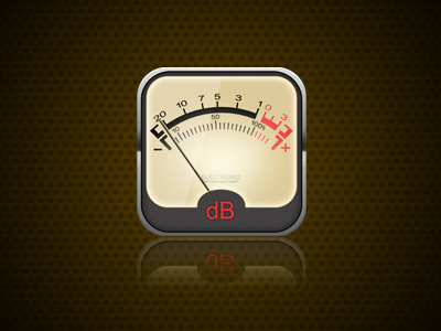
I was a lot harder to find an already existing app icon for a decibel meter, but this one seems to be a good example for me to look at. The ‘dB’ at the bottom makes it clear for the user to see what exactly it is that they are using, while the colour scheme is also traditional and works well. Again, the numbers could possibly be confusing when reduced down to the tiny size required by the iPhone, so I would have to simplify this example to get something more suitable for my own final app design.

Maslow’s Pryamid

by brucewilsondesign

Maslow's Prymid

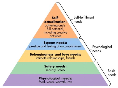
Maslow’s hierarchy of needs is a theory in psychology proposed by Abraham Maslow in his 1943 paper “A Theory of Human Motivation”. Maslow subsequently extended the idea to include his observations of humans’ innate curiosity. His theories parallel many other theories of human developmental psychology, some of which focus on describing the stages of growth in humans. Maslow used the terms Physiological, Safety, Belongingness and Love, Esteem, Self-Actualization and Self-Transcendence needs to describe the pattern that human motivations generally move through.

Maslow studied what he called exemplary people such as Albert Einstein, Jane Addams, Eleanor Roosevelt, and Frederick Douglass. Maslow studied the healthiest 1% of the college student population.

Maslow’s theory was fully expressed in his 1954 book Motivation and Personality.

The Maslow hierarchy remains a very popular framework in sociology research and secondary and higher psychology instruction.

Each of us is motivated by needs. Our most basic needs are inborn, having evolved over tens of thousands of years. Abraham Maslow’s Hierarchy of Needs helps to explain how these needs motivate us all.

Maslow’s Hierarchy of Needs states that we must satisfy each need in turn, starting with the first, which deals with the most obvious needs for survival itself.

Only when the lower order needs of physical and emotional well-being are satisfied are we concerned with the higher order needs of influence and personal development.

Conversely, if the things that satisfy our lower order needs are swept away, we are no longer concerned about the maintenance of our higher order needs.

At this time the Hierarchy of Needs model comprised five needs, this original version remains for most people the definitive Hierarchy of Needs.

Pedometer

by brucewilsondesign

A pedometer is a measuring device for the number of footsteps that the owner of the iPhone takes, this is done by counting the number of bumps that the iPhone detects from the users foot hitting the ground.  Therefore a foot or shoe is the first thing that springs to mind. I will work along these lines when starting to  come up with my own ideas.

Pedometer

I really like the simple illustration used with this icon, it works well in contrast to the rather complex and busy background. This is defiantly something that I will look at with my own apps, a simple illustration on a more detailed background. I also like the powerful purple colouring that has been used. A good example this one.

Speedometer

by brucewilsondesign

A speedometer is a measuring device, therefore a speed dial is the first thing that springs to mind. I will work along these lines when starting to  come up with my own ideas.Speedometer

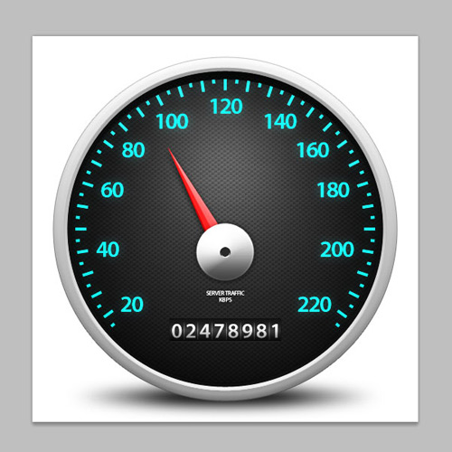
This speed dial would make a perfect app icon. The shadow beneath the dial lends itself perfectly to being placed on a white square box. The image isn’t cluttered with numbers which will allow the icon to work when reduced to the tiny size required for the iPhone screen.

Speedometer

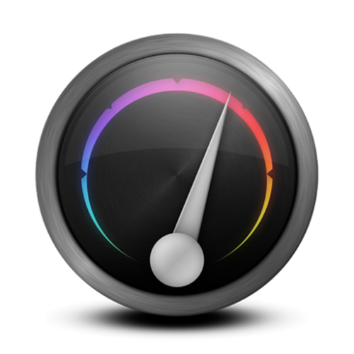
I like the colour schemes on this dial, they are nice and modern and would suit a speedometer iPhone app. Perhaps a simplified version of the dial would work perfectly for my own app.

Semiotics

by brucewilsondesign

Definition: The study of signs and symbols and their use or interpretation.

Semiotics studies all kinds of signs: from road signs to music to art to human language, and possibly to programming languages as well.

When it comes to this particular design project it is looking at how a viewer will interpret the message of a piece and changing our work so the viewer will then correctly interpret the correct message that is intended by my work.
An example we looked at was what happens in the mind of someone that is told to think of London. We found that almost everyone of the seven people that were asked came up with the same ideas or images, such as Big Ben, The London Eye, Houses of Parlament, and so on. This was clearly going to be the result. However it is interesting that when asked, everyone said that the mental image they had was of London during the day time. When asked to think of Tokyo, everyone pictures the city at night. Something that people living in Tokyo probably wouldn’t think, they also would think of the city during daylight hours.

Which sums up the message of semiotics. With design and visual communication it is important that was you intend the viewer to see they see, cultural and national differences must be bridged for a design to be truly successful and bridge these gaps and to articulate to all audiences when needed. The correct message must connect correctly with the viewers.

Semiotics

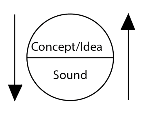
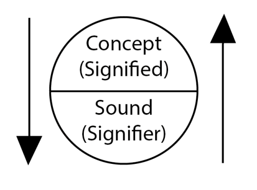
Ferdinand de Saussure was a Swiss linguist whose ideas laid a foundation for many significant developments in linguistics in the 20th century. He is widely considered one of the fathers of 20th-century linguistics. Most notably for this project, Saussure is one of the founding fathers of semiotics with his concept of the sign/signifier/signified/referent forms the core of the field. Above is his concept.
Semiotics

This is Charles Pierce’s modified model of  Saussure’s principles.

The Measuring Apps

by brucewilsondesign

The seven Apps are all measuring devices:

Speedometer – Measuring speed
Pedometer – Measuring the number of footsteps the user takes
Decibel metre – Measuring the amount of noise
Barometer – Measuring atmospheric pressure
Thermometer – Measuring temperature
Anemometer – Measuring wind speed
Altimeter – Measuring altitude

The iPhone Home Screen

by brucewilsondesign

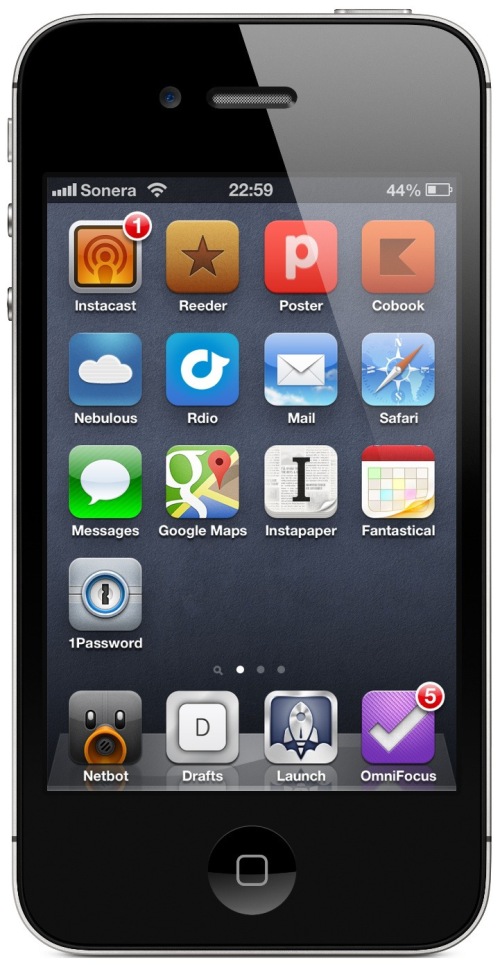
The home screen of the iPhone is made up of the apps that are installed into the phone to personalize it to the owners needs. This is where my final app icon will go.

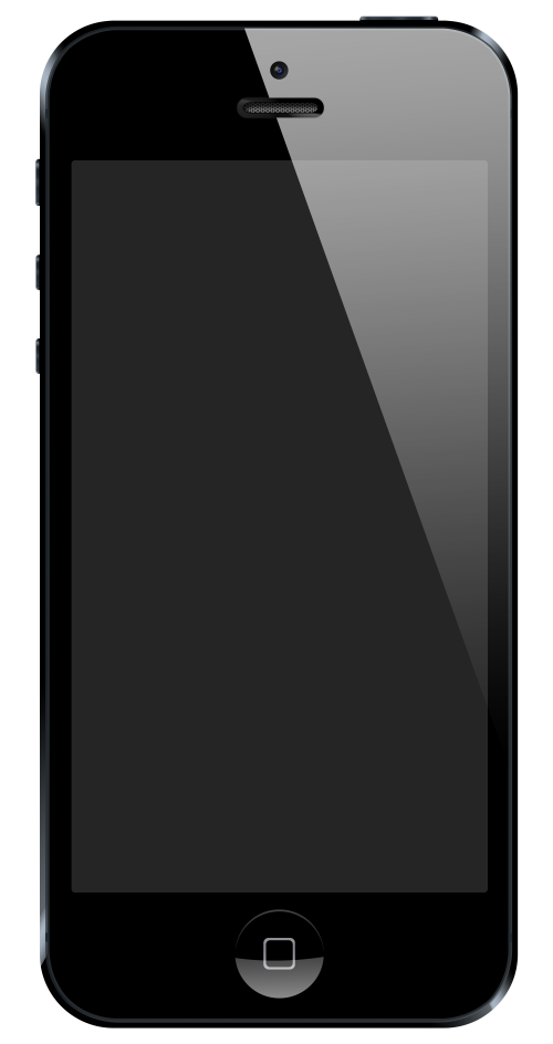
The iPhone 5

It is clear from the image above that the app icons need to be bright and colourful as well as eye catching and clever to draw the owners attention when flicking through their phone. Much of the time, the owner of the phone will be trying to find a specific app to meet their needs, so the icon has to make it easy for them to recognize and access. This will be even simpler if the app icon is easy to remember and recognize after using it a number of times.

Before the app has been downloaded it is in the App Store where they really have to fight to get noticed, so my icon must meet these needs and stand out from those around it.

iPhone Background

by brucewilsondesign

The iPhone is a line of smart-phones designed and marketed by Apple. It runs Apple’s iOS operating system. The first iPhone was released on June 29, 2007; the most recent iPhone, the sixth-generation iPhone 5, on September 21, 2012. The user interface is built around the device’s multi-touch screen, including avirtual keyboard.

The iPhone 5

An iPhone can shoot video ,take photos, play music, send and receive email, browse the web, send texts, and receive-visual voicemail. Other functions—games, reference, GPS navigation, social networking, etc.—can be enabled by downloading apps.

Apps can be downloaded from the App Store offered more than 775,000 apps made by Apple and third parties.

Digital Media

by brucewilsondesign

­­­What is Digital Media?

“Digital media is defined in a variety of ways…digital media is defined as those technologies that allow users to create new forms of interaction, expression, communication, and entertainment in a digital format. The term digital has been coined to reflect the evolution of multimedia computing into multi sensory communications. The goal of multimedia and now digital media is to reproduce as closely as possible the reliability and effectiveness found in face-to-face communications and then emulate that in online environments such as social networking, using computers and other technologies.”

Teachers discovering Computers: Integrating technology and digital media in the Classroom. (Shelly, 2007)

University of Worcester.

‘Digital Media’ is the combination of digital technology & creativity. Examples of this could include:

    * Interactive multimedia

    * Digital video and film production

    * Web design

    * Image creation

    * Digital photography

    * Interface design

    * Digital animation

    * 3D modeling

    * Digital sound technology

    * Graphic design for print and web

New Project – iPhone Apps

by brucewilsondesign

Project:  iPhone Apps

Module: Design for Digital Media 15 credits

Preamble

Non verbal communication in the form of pictograms, ideograms and symbols has been with us for thousands of years, and even our modern Latin alphabet is little more than symbols that have evolved over the past several thousand years. Today signage is designed with immediacy in mind, the message or instruction has to be communicated with speed: eg. consider motorway signage.

The focus of this project is upon non-verbal communication, although you are permitted to use some typography where appropriate.

Graphic design is mostly about sending the right message to the right group of people, usually to persuade, educate and inform. The latter of these is what this project is concerned with.

As well developing your computer skills, this project will help you develop your ability to make concrete complex abstract concepts and reduce them to their simplest visual forms whilst retaining meaning.

The Brief

You are to research and design seven icons for Apps for the iPhone.  Present  planning and development for each icon in your sketchbook.
A digital company has produced seven Apps in a series. Each icon should demonstrate the concept of the theme but the icons should also show by their design that they are part of a series.
The seven Apps are all measuring devices:

  • Speedometer
  • Pedometer
  • Decibel metre
  • Barometer
  • Thermometer
  • Anemometer
  • Altimeter

You should use the correct measurements and carefully consider the very small scale of the Apps’ icons. You should also show in your sketchbook the navigation or usability of your App but the App does not need to actually function.

As well as producing seven icons for Apps you should also provide in your sketchbook a competent navigation /usability plan and some thumbnails for the actual pages of one of the above Apps. You do not need to produce final designs for these but your sketchbook work must demonstrate the elements of interactivity within an App.

Learning Outcomes

The specific Learning Outcomes for the module, against which you will be assesses are listed on Moodle and in the Course Handbook. You are strongly advised to make yourself familiar with these and to ensure that throughout your work you are providing evidence of how you have achieved these. Labelling the evidence for each outcome in your sketchbook is highly advised.

Research

You will have to research, amongst other things, non-verbal communication, ideograms, pictograms and icon design.

Evaluation

by brucewilsondesign

Printed & Made

by brucewilsondesign

The Final Beer Mat

by brucewilsondesign

Development

by brucewilsondesign

Creating the Beer Mat

by brucewilsondesign

The Final Character

by brucewilsondesign

The Character

Final Character

A Character

by brucewilsondesign