Pedometer
by brucewilsondesign
Here is my final pedometer app icon. I followed the same idea as I have done with the other icons, which is do use the space to replicate a real life version of the purpose of the app. So this icon is to represent a pedometer.
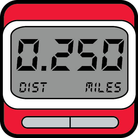
A used a nice red that will draw the users eye towards the icon and make it easy for them to find when in a hurry. The numbers and text a purely to make the icon fit what would be expected of a real life pedometer. The grey screen is realistic, and I managed to make it believable but still simple at the same time. I feel it has worked very well and should get people using the app frequently.
